常见问题
本页收集了 Touying 使用中的常见问题与解决方案。
主题与配置
如何选择和切换主题?
Touying 提供多个内置主题,通过导入并应用主题函数即可切换:
#import "@preview/touying:0.7.4": *
#import themes.simple: *
#show: simple-theme
= Section

== Slide

Using the simple theme.
其他内置主题包括 themes.default、themes.metropolis、themes.aqua、themes.dewdrop、themes.stargazer、themes.university 等。
如何自定义主题颜色?
使用 config-colors(primary: ...) 自定义主题的主色调:
#import "@preview/touying:0.7.4": *
#import themes.metropolis: *
#show: metropolis-theme.with(
  aspect-ratio: "16-9",
  config-colors(primary: rgb("#d94f00")),
  config-info(title: [Custom Color], author: [Author]),
)
= Section

== Slide

The header now uses the custom primary color.
如何在正文中访问当前主题颜色?
主题颜色保存在 self.colors 中。在普通幻灯片正文里,可以用 touying-fn-wrapper 包裹一个函数,让 Touying 把当前幻灯片上下文作为 self 传入:
#import "@preview/touying:0.7.4": *
#import themes.simple: *
#show: simple-theme.with(aspect-ratio: "16-9")

= Section

== Slide

#touying-fn-wrapper((self: none) => text(fill: self.colors.primary)[
  This text uses the current theme's primary color.
])

#touying-fn-wrapper((self: none) => rect(
  fill: self.colors.secondary,
  width: 4em,
  height: 1em,
))
如果你正在编写已经接收 self 的主题方法或回调函数,则可以直接使用 self.colors.primary、self.colors.neutral-lightest 等颜色。
config-common 配置参考
config-common 有哪些常用配置项?
config-common 是 Touying 的核心配置函数,以下是常用配置项及其默认值和说明:
| 配置项 | 默认值 | 说明 |
|---|---|---|
handout | false | 讲义模式,禁用动画 |
slide-level | 2 | 控制哪个标题级别创建新幻灯片 |
frozen-counters | () | 冻结计数器列表 |
show-strong-with-alert | true | 粗体文本使用 alert 样式 |
show-notes-on-second-screen | none | 第二屏幕演讲者备注(none/bottom/right) |
horizontal-line-to-pagebreak | true | 将 --- 水平线转换为分页符 |
nontight-list-enum-and-terms | false | 列表项间距控制 |
show-hide-set-list-marker-none | true | #pause 后隐藏列表标记 |
show-bibliography-as-footnote | none | 参考文献显示为脚注 |
scale-list-items | none | 缩放列表项大小 |
new-section-slide-fn | none | 章节幻灯片函数 |
freeze-slide-counter | false | 冻结幻灯片计数器 |
enable-pdfpc | true | 启用 pdfpc 支持 |
breakable | true | 是否允许幻灯片内容溢出到下一页 |
clip | false | 是否裁剪溢出内容(仅在 breakable: false 时生效) |
detect-overflow | true | 是否检测溢出并报错(仅在 breakable: false 时生效) |
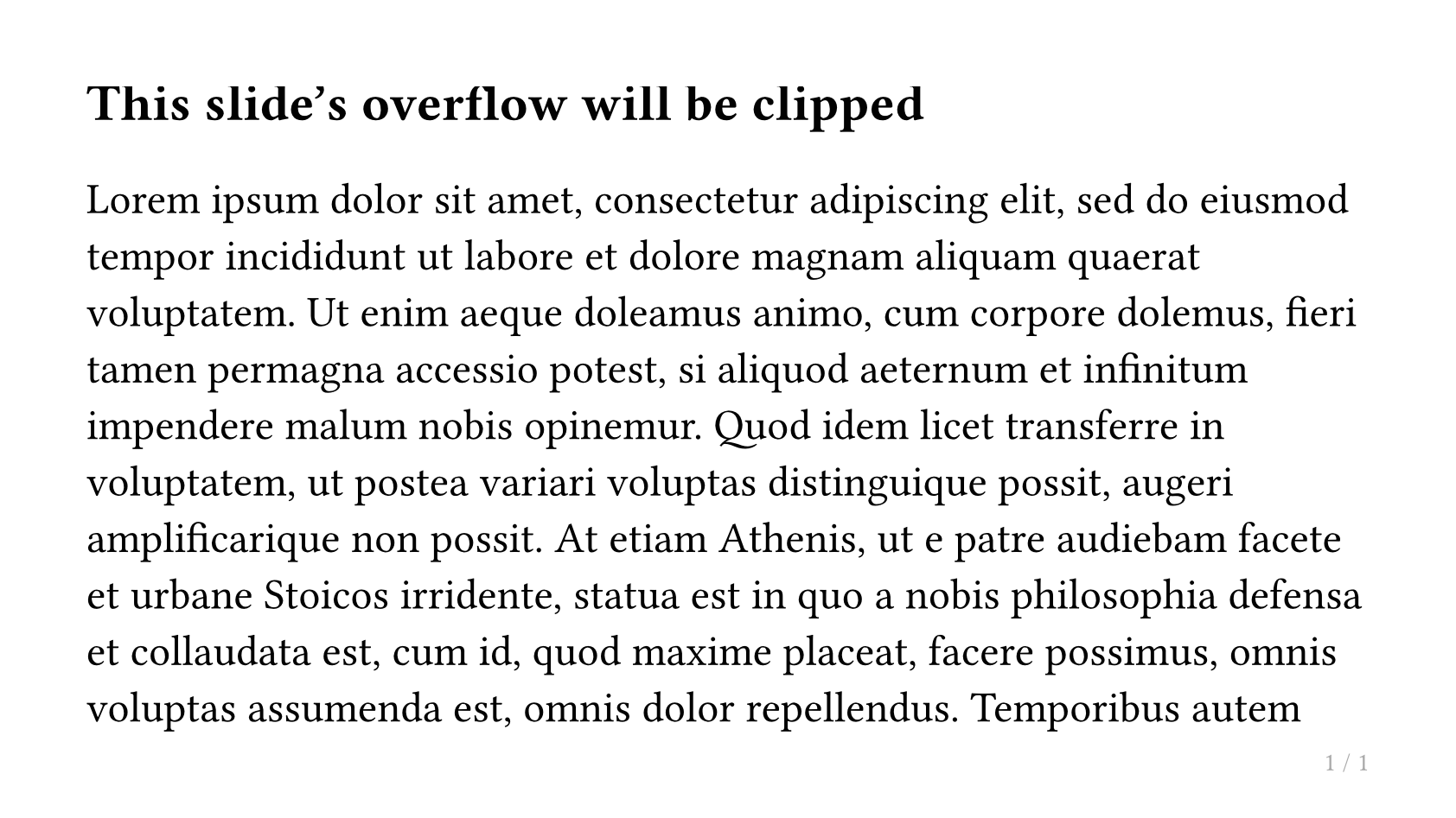
如何防止幻灯片内容溢出到下一页?
使用 config-common(breakable: false) 可以防止幻灯片内容自动溢出到下一页。默认情况下(breakable: true),超出幻灯片高度的内容会自动创建新页面;设置为 false 后,内容将被限制在单页内,这对于需要保证源码与输出页面一一对应的场景(如 AI 智能体工作��流)非常有用。
配合使用的参数:
clip(默认false):设为true时,超出幻灯片高度的内容会被视觉截断。detect-overflow(默认true):设为true时,会通过布局测量检测溢出,一旦内容高度超出幻灯片高度则直接panic()报错,便于及早发现问题;设为false可避免额外的布局开销。
// Prevent overflow, panic on overflow (default behavior when breakable: false)
#show: simple-theme.with(
  config-common(breakable: false),
)

// Prevent overflow and visually clip overflowing content
#show: simple-theme.with(
  config-common(breakable: false, clip: true),
)

// Prevent overflow, disable overflow detection (performance-first)
#show: simple-theme.with(
  config-common(breakable: false, detect-overflow: false),
)
也可以在演示文稿中途通过 touying-set-config 切换:
== This slide's overflow will be clipped

// Enable clipping for a specific slide
#show: touying-set-config.with(config-common(clip: true))

#lorem(500)
如何使用半透明遮罩替代完全隐藏?
使用 config-methods(cover: utils.semi-transparent-cover) 配置,使被隐藏的内容以半透明形式显示:
#import "@preview/touying:0.7.4": *
#import themes.simple: *

#show: simple-theme.with(
  aspect-ratio: "16-9",
  config-methods(cover: utils.semi-transparent-cover),
)

= Section

== Slide

#pause

This content is shown with a semi-transparent cover.
如何使用 preamble 在每张幻灯片前插入内容?
使用 config-common(preamble: ...) 在每张幻灯片前插入固定内容,subslide-preamble 在子幻灯片前插入:
#import "@preview/touying:0.7.4": *
#import themes.simple: *

#show: simple-theme.with(
  aspect-ratio: "16-9",
  config-common(
    preamble: text(gray)[This appears before every slide],
    subslide-preamble: (2: [Special prelude for subslide 2]),
  ),
)

= Section

== Slide

Content here.

#pause

More content.
如何使用 --- 分隔幻灯片?
当 horizontal-line-to-pagebreak: true 时,可以在标题之间使用 --- 来创建新幻灯片:
#import "@preview/touying:0.7.4": *
#import themes.simple: *
#show: simple-theme
= Section

== First Slide

Content here.

---

== Second Slide

Created by `---`.
如何让列表项在 #pause 后隐藏标记符号?
show-hide-set-list-marker-none: true 会在 #pause 后隐藏列表标记:
#show: simple-theme.with(
  config-common(show-hide-set-list-marker-none: true),
)
如何缩放列表项大小?
使用 scale-list-items: 0.8 将列表项缩小到原始大小的 80%:
#show: simple-theme.with(
  config-common(scale-list-items: 0.8),
)
布局与分栏
如何创建两栏布局?
使用带 composer 参数的 slide 将内容分成多列:
#import "@preview/touying:0.7.4": *
#import themes.simple: *
#show: simple-theme
#slide(composer: (1fr, 1fr))[
  == Left Column

  Some text on the left side.
][
  == Right Column

  Some text on the right side.
]
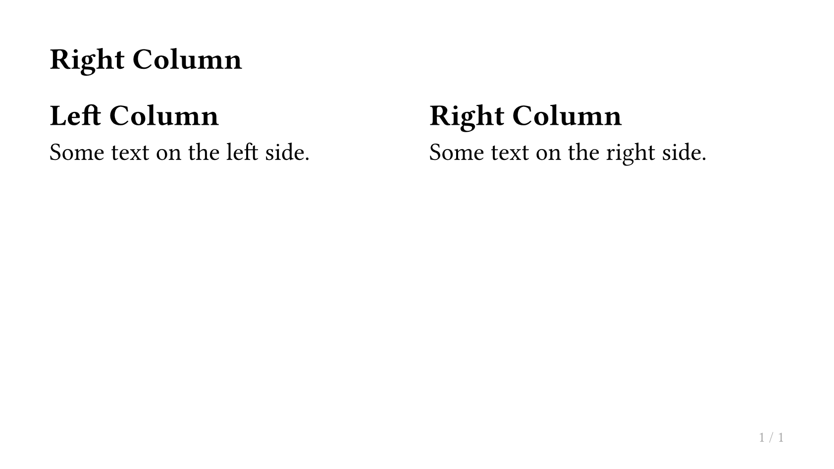
如需不等宽的列,可调整分数比例,例如 (2fr, 1fr)。
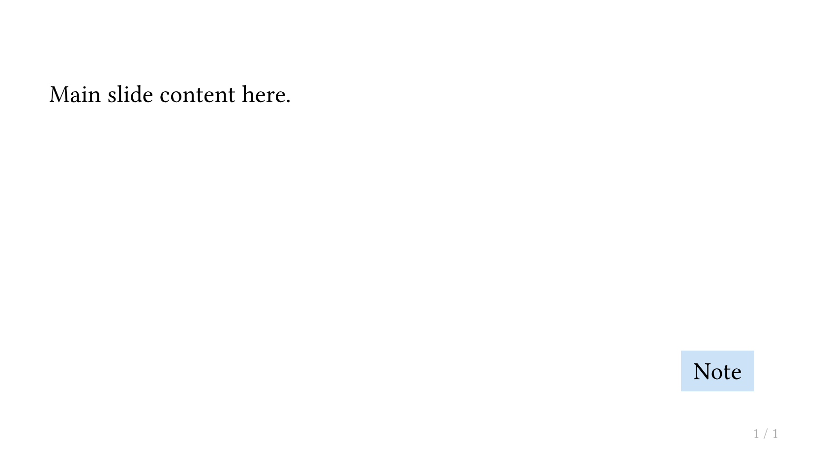
如何将内容放置在绝对位置?
使用 Typst 的 place 函数进行绝对定位:
#import "@preview/touying:0.7.4": *
#import themes.simple: *
#show: simple-theme
#slide[
  Main slide content here.

  #place(bottom + right, dx: -1em, dy: -1em)[
    #rect(fill: blue.lighten(80%), inset: 0.5em)[Note]
  ]
]
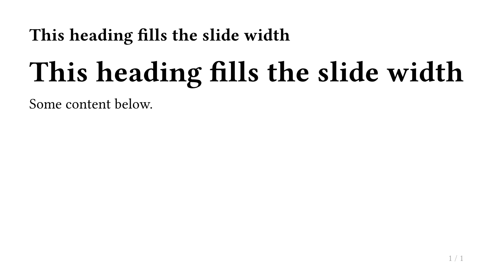
如何让内容填满幻灯片的剩余高度或宽度?
使用 utils.fit-to-height 或 utils.fit-to-width:
#import "@preview/touying:0.7.4": *
#import themes.simple: *
#show: simple-theme
#slide[
  #utils.fit-to-width(1fr)[
    == This heading fills the slide width
  ]

  Some content below.
]
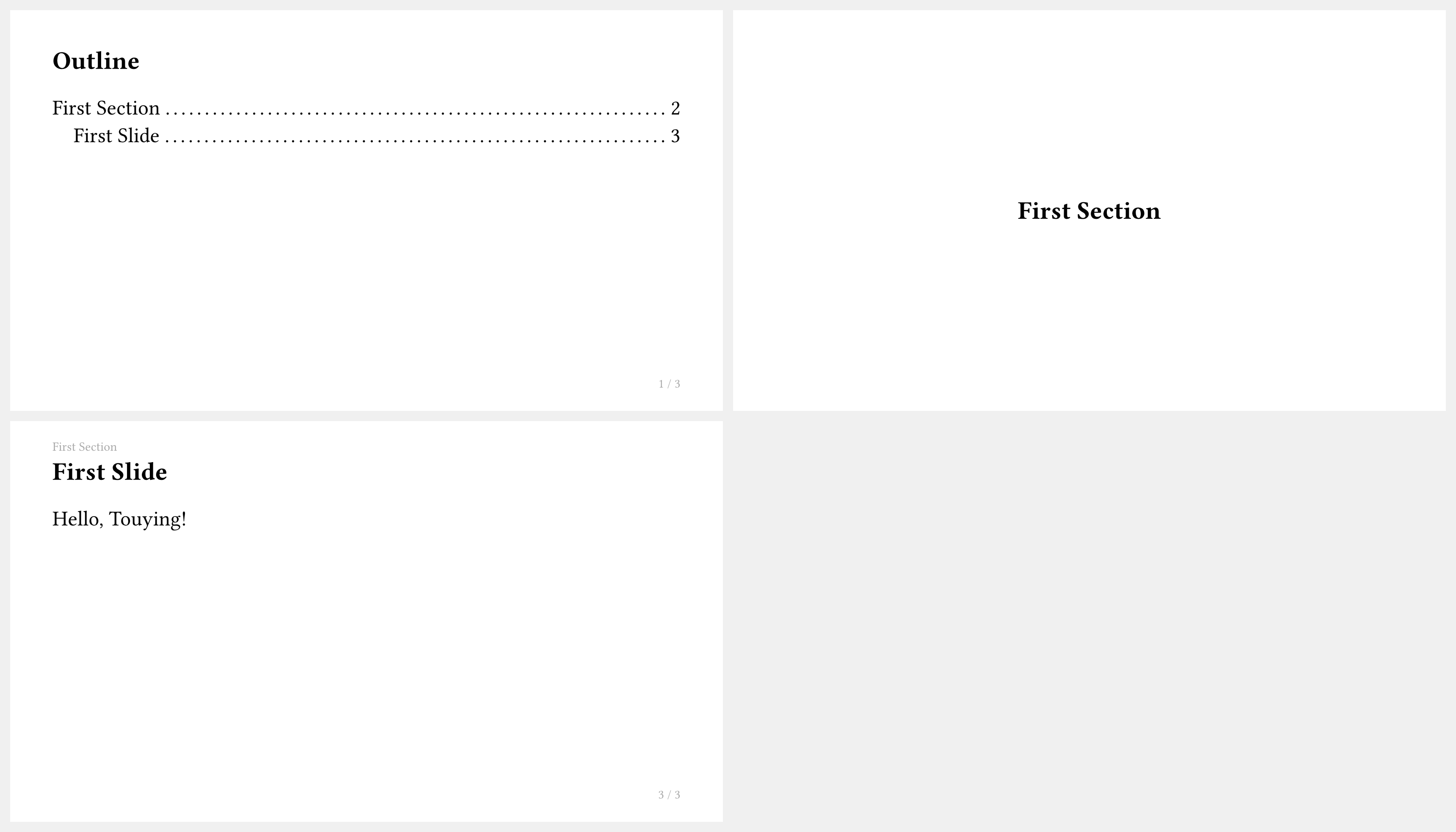
目录
如何显示目录?
用 components.adaptive-columns 包裹 Typst 内置的 outline:
#import "@preview/touying:0.7.4": *
#import themes.simple: *
#show: simple-theme.with(aspect-ratio: "16-9")
== Outline <touying:hidden>

#components.adaptive-columns(outline(title: none, indent: 1em))

= First Section

== Introduction

Hello, Touying!

= Second Section

== Details

More content here.
<touying:hidden> 标签可将目录幻灯片本身从目录中隐藏。
如何只保留主目录并禁用自动章节页?
有些主题在遇到新的一级章节(=)时,会自动生成章节页(通常是目录或章节概览)。可以用 config-common(new-section-slide-fn: none) 关闭这些自动章节页,然后只保留你手动编写的主目录页:
#import "@preview/touying:0.7.4": *
#import themes.metropolis: *
#show: metropolis-theme.with(
  aspect-ratio: "16-9",
  config-common(new-section-slide-fn: none),
)

== Outline <touying:hidden>

#components.adaptive-columns(outline(title: none, indent: 1em))

= First Section

== First Slide

= Second Section

== Second Slide
如何为目录中的章节添加编号?
结合 numbly 包和 #set heading(numbering: ...):
#import "@preview/touying:0.7.4": *
#import themes.simple: *
#import "@preview/numbly:0.1.0": numbly
#set heading(numbering: numbly("{1}.", default: "1.1"))
#show: simple-theme.with(aspect-ratio: "16-9")
== Outline <touying:hidden>

#components.adaptive-columns(outline(title: none, indent: 1em))

= First Section

== First Slide

= Second Section

== Second Slide
如何显示带进度高亮的目录?
使用 components.progressive-outline 高亮当前章节:
#import "@preview/touying:0.7.4": *
#import themes.dewdrop: *
#show: dewdrop-theme.with(aspect-ratio: "16-9")
= First Section

== Outline

#components.progressive-outline()

= Second Section

== Slide
参考文献与引用
如何将引用显示为脚注?
将 bibliography(...) 值传递给 config-common(show-bibliography-as-footnote: ...):
#import "@preview/touying:0.7.4": *
#import themes.simple: *
#let bib = bytes(
  "@book{knuth,
    title={The Art of Computer Programming},
    author={Donald E. Knuth},
    year={1968},
    publisher={Addison-Wesley},
  }",
)
#show: simple-theme.with(
  aspect-ratio: "16-9",
  config-common(show-bibliography-as-footnote: bibliography(bib)),
)
= Citations

== Footnote Example

This is a famous book. @knuth
如何在末尾添加参考文献幻灯片?
使用 magic.bibliography(...) 显示参考文献幻灯片:
#import "@preview/touying:0.7.4": *
#import themes.simple: *
#let bib = bytes(
  "@book{knuth,
    title={The Art of Computer Programming},
    author={Donald E. Knuth},
    year={1968},
    publisher={Addison-Wesley},
  }",
)
#show: simple-theme.with(
  aspect-ratio: "16-9",
  config-common(show-bibliography-as-footnote: bibliography(bib)),
)
= Intro

== Slide

Some cited content. @knuth

== References

#magic.bibliography(title: none)
演讲者备注
如何为幻灯片添加演讲者备注?
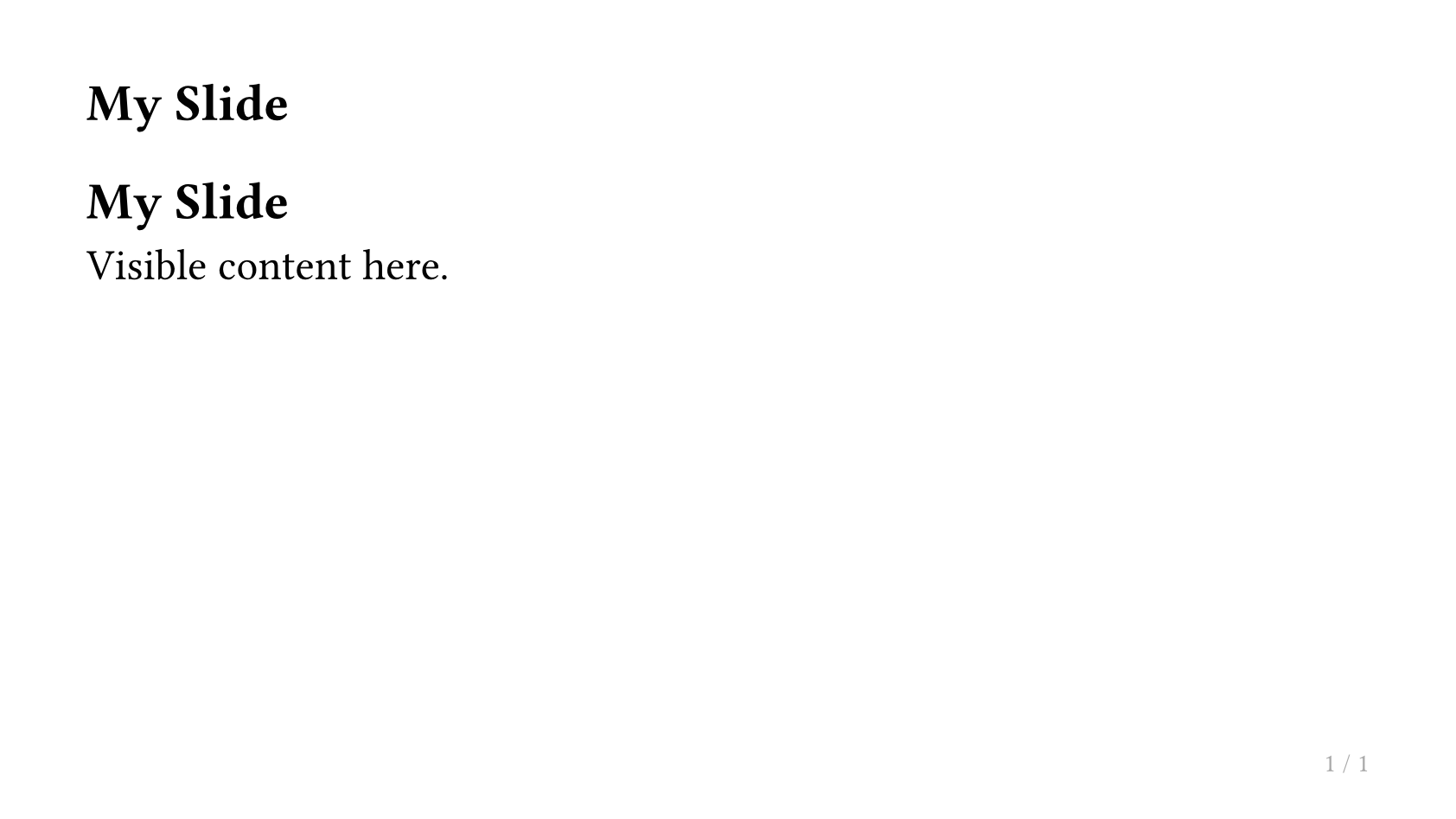
在幻灯片的任意位置使用 #speaker-note[...] 函数:
#import "@preview/touying:0.7.4": *
#import themes.simple: *
#show: simple-theme
#slide[
  == My Slide

  Visible content here.

  #speaker-note[
    - Remind the audience of the previous topic.
    - Emphasize the key takeaway.
    - Time check: should be at 10 min mark.
  ]
]
演讲者备注默认不会出现在幻灯片输出中。
如何在第二屏幕上显示演讲者备注?
使用 config-common(show-notes-on-second-screen: right) 在幻灯片旁边显示备注:
#show: simple-theme.with(
  aspect-ratio: "16-9",
  config-common(show-notes-on-second-screen: right),
)
此功能与 pdfpc 和 pympress 等演示工具兼容。
幻灯片编号与附录
如何在页脚显示幻灯片编号?
使用 utils.slide-counter.display() 显示当前编号,utils.last-slide-number 显示总数:
#import "@preview/touying:0.7.4": *
#import themes.simple: *
#show: simple-theme.with(
  aspect-ratio: "16-9",
  config-page(
    footer: context [
      #utils.slide-counter.display() / #utils.last-slide-number
    ],
  ),
)
= Section

== First Slide

The footer shows the slide number.

== Second Slide

Still counting.
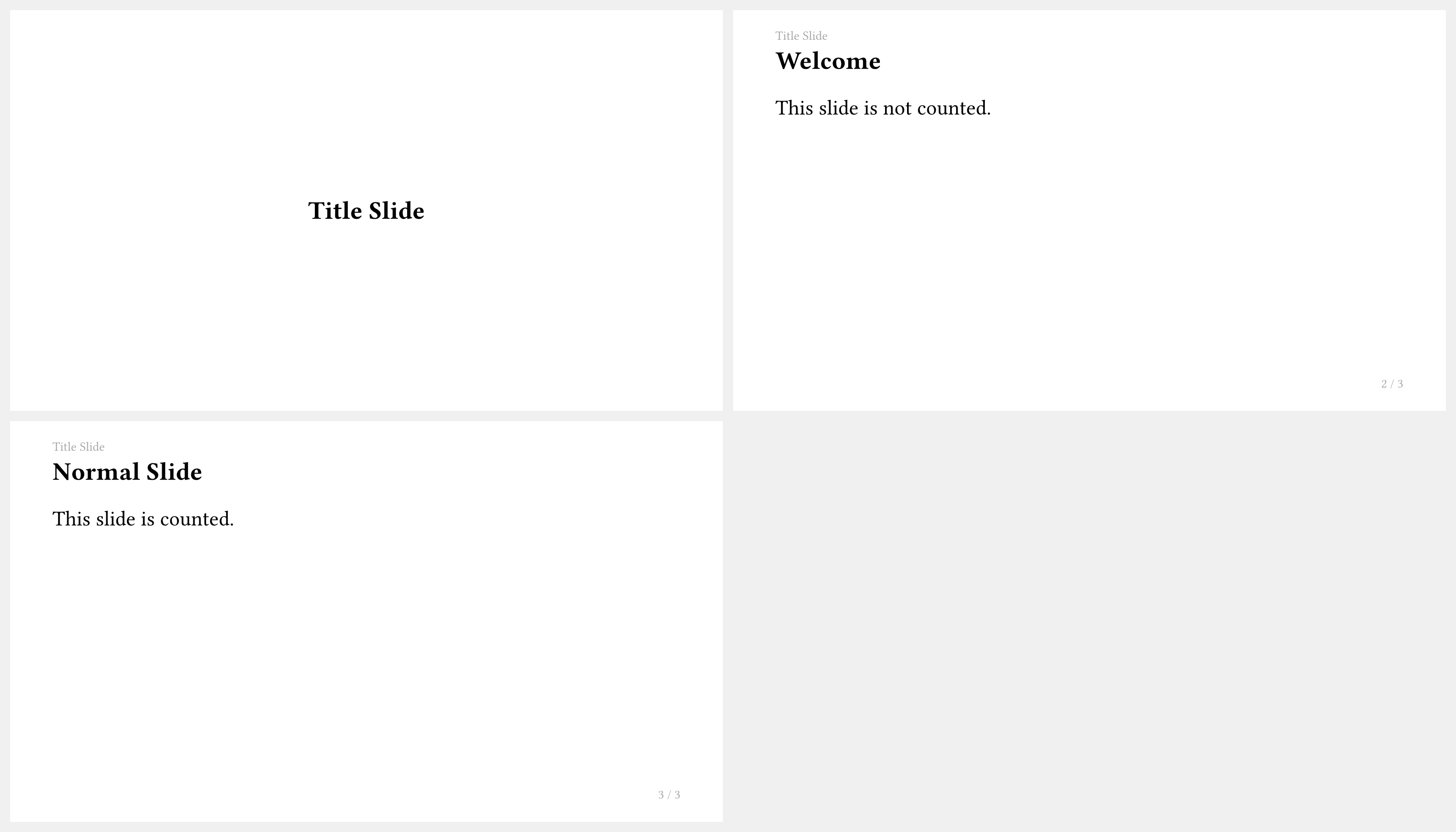
如何将幻灯片标记为不计数?
在标题上添加 <touying:unnumbered> 标签:
#import "@preview/touying:0.7.4": *
#import themes.simple: *
#show: simple-theme
= Title Slide <touying:unnumbered>

== Welcome

This slide is not counted.

== Normal Slide

This slide is counted.
如何使用附录以不影响幻灯片总数?
在主要内容之后使用 #show: appendix。此后的幻灯片不会递增幻灯片计数器:
#import "@preview/touying:0.7.4": *
#import themes.simple: *
#show: simple-theme.with(aspect-ratio: "16-9")
= Main Content

== Introduction

This is slide 1.

== Results

This is slide 2.

#show: appendix

= Appendix

== Extra Material

This slide is in the appendix and does not increment the main counter.
动画与动态内容
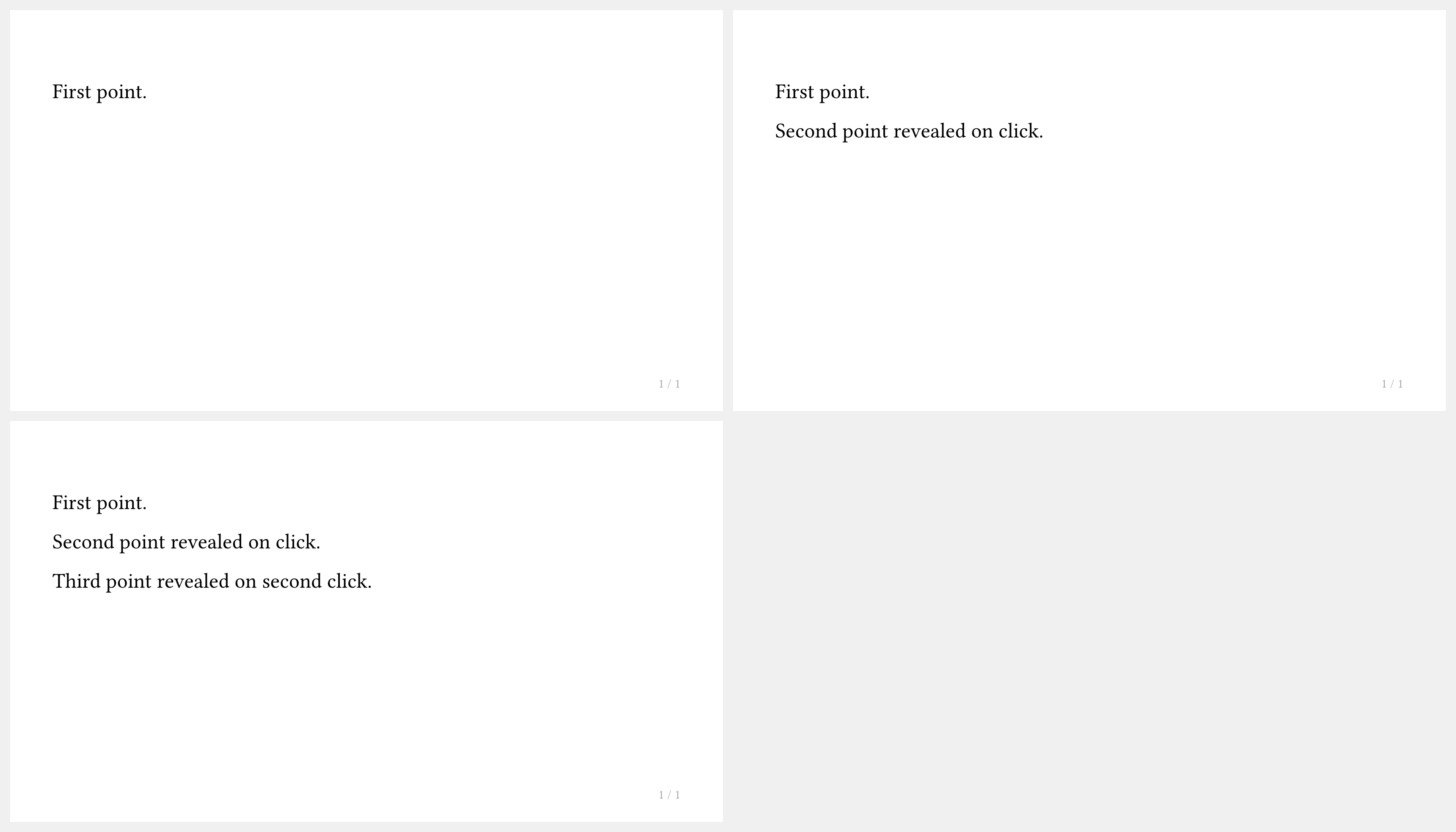
如何使用 #pause 逐步展示内容?
在 #slide 内的内容块之间放置 #pause:
#import "@preview/touying:0.7.4": *
#import themes.simple: *
#show: simple-theme
#slide[
  First point.

  #pause

  Second point revealed on click.

  #pause

  Third point revealed on second click.
]
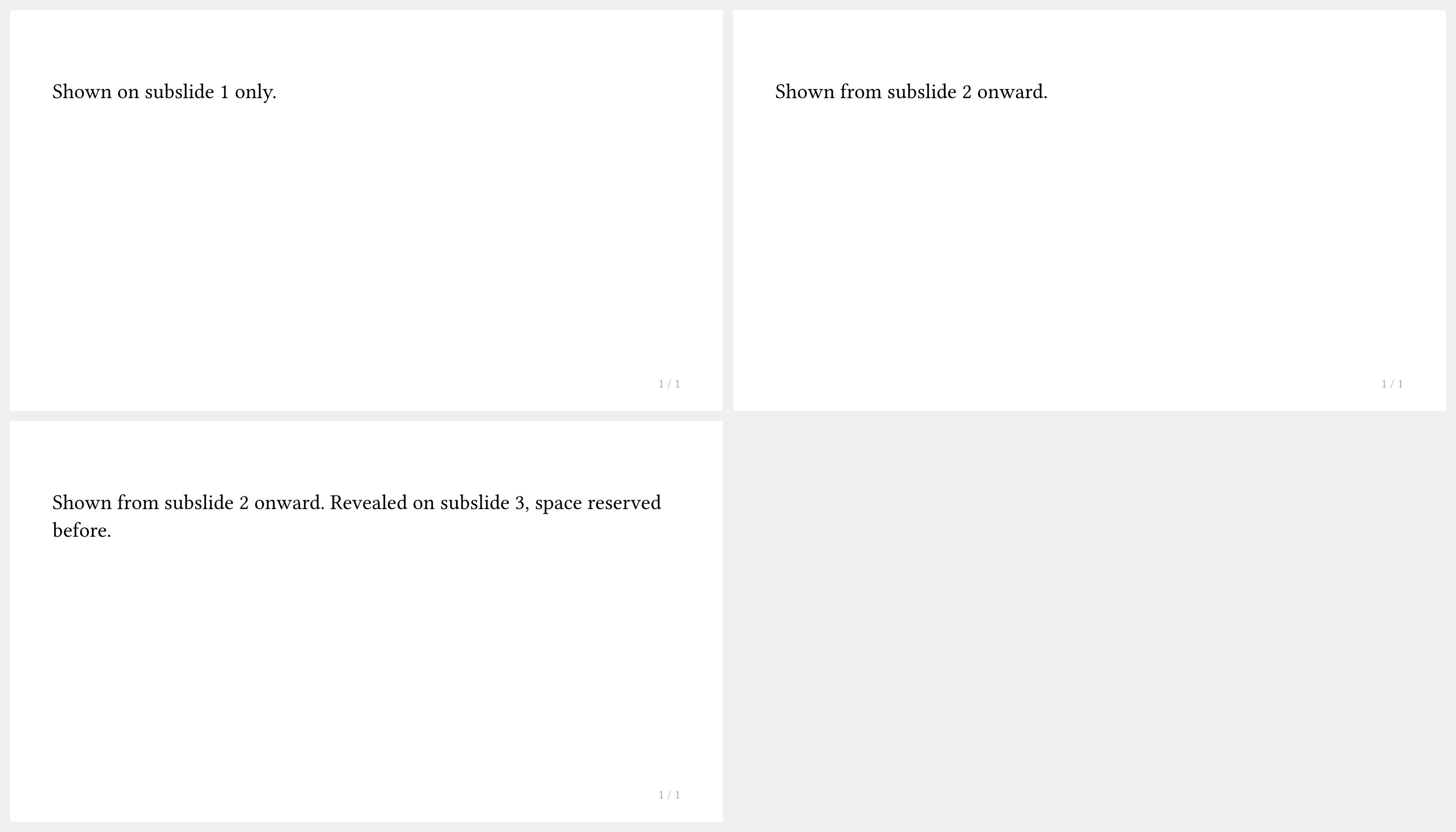
如何仅在特定子幻灯片上显示内容?
使用 #only("...") 在特定子幻灯片上显示内容,或用 #uncover("...") 显示内容同时保留其占位空间:
#import "@preview/touying:0.7.4": *
#import themes.simple: *
#show: simple-theme
#slide[
  #only("1")[Shown on subslide 1 only.]
  #only("2-")[Shown from subslide 2 onward.]
  #uncover("3-")[Revealed on subslide 3, space reserved before.]
]
为什么 #pause 在 context 表达式内不起作用?
#pause 使用元数据注入机制,在 context { ... } 块内无法正常工作。请改用回调式 slide 来访问 self.subslide:
#import "@preview/touying:0.7.4": *
#import themes.simple: *
#show: simple-theme
#slide(self => {
  let (uncover, only) = utils.methods(self)
  [First content.]
  linebreak()
  uncover("2-")[Revealed on subslide 2.]
  linebreak()
  only("3")[Only on subslide 3.]
})

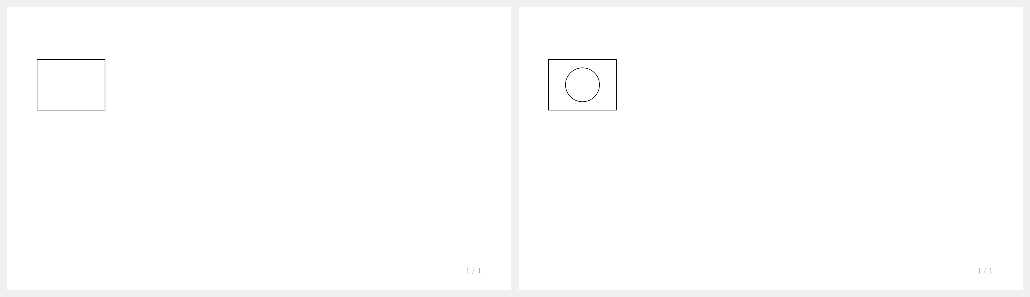
如何在 CeTZ 绘图中使用 #pause?
使用 touying-reduce 包裹 CeTZ canvas,使 Touying 能够为其添加动画:
#import "@preview/cetz:0.5.2"

#let cetz-canvas = touying-reduce.with(cetz)

#slide[
  #cetz-canvas({
    import cetz.draw: *
    rect((0, 0), (4, 3))
    (pause,)
    circle((2, 1.5), radius: 1)
  })
]
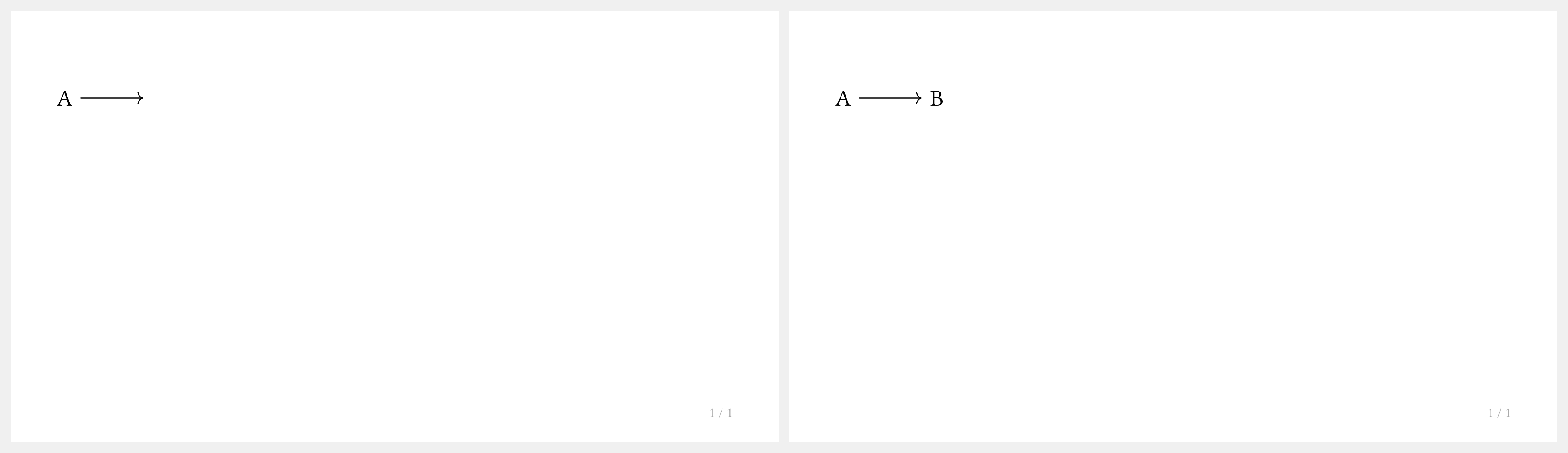
如何在 Fletcher 图表中使用 #pause?
使用 touying-reduce 包裹 Fletcher 图表,使 Touying 能够自动查找 Fletcher 的 reducer 绑定:
#import "@preview/fletcher:0.5.8" as fletcher: diagram, node, edge

#let fletcher-diagram = touying-reduce.with(fletcher)

#slide[
  #fletcher-diagram(
    node((0, 0), [A]),
    edge("->"),
    (pause,),
    node((1, 0), [B]),
  )
]
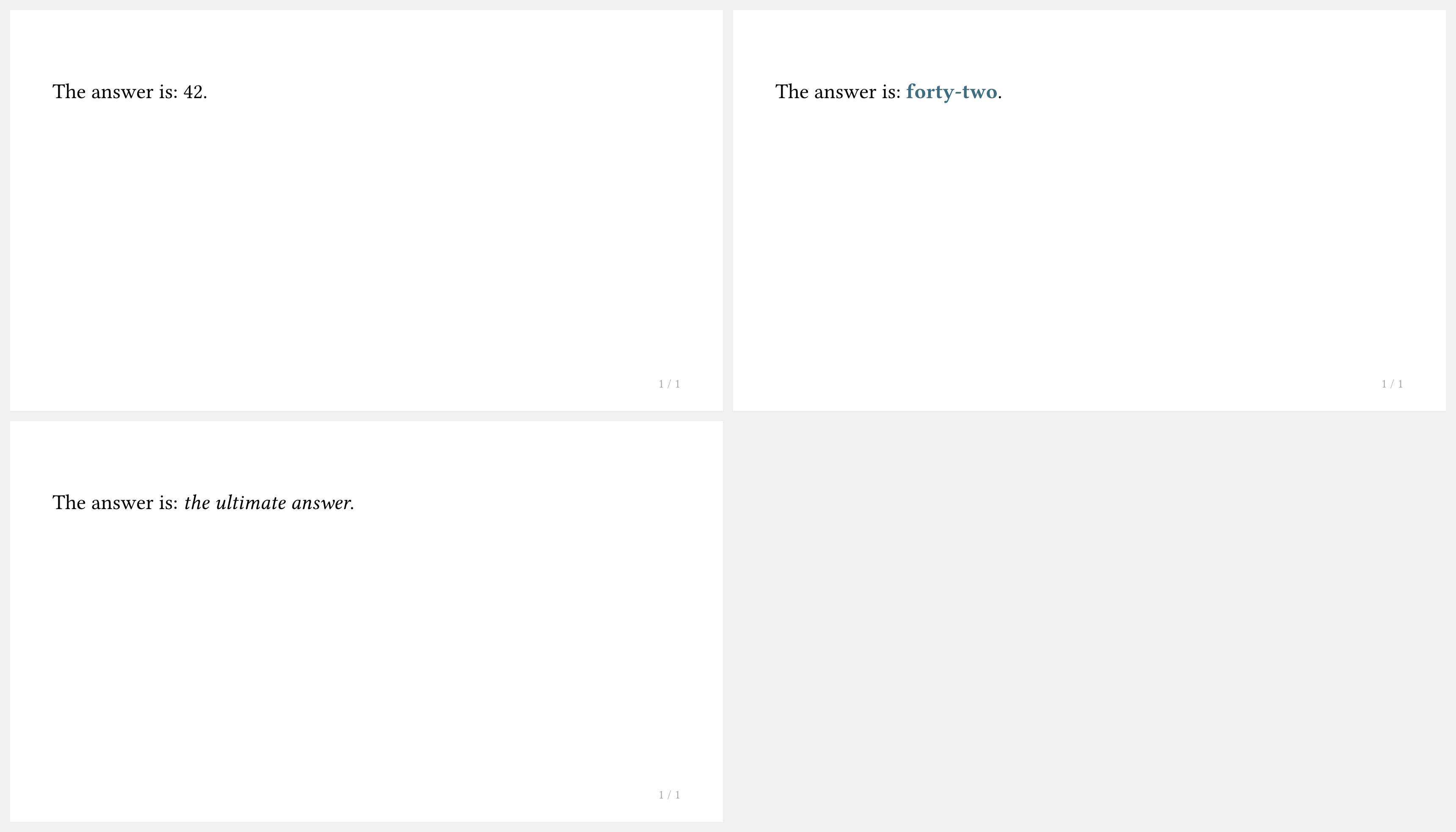
如何在子幻灯片间展示替换内容?
使用 #alternatives 在不同版本的内容之间切换:
#import "@preview/touying:0.7.4": *
#import themes.simple: *
#show: simple-theme
#slide[
  The answer is: #alternatives[42][*forty-two*][_the ultimate answer_].
]
如何开启讲义模式(禁用动画)?
在主题设置中使用 config-common(handout: true):
#show: simple-theme.with(
  aspect-ratio: "16-9",
  config-common(handout: true),
)
在讲义模��式下,每张幻灯片只输出最后一个子幻灯片。
字体与文本
如何更改演示文稿的字体?
在主题设置之前或之后使用 #set text(...) 规则:
#import "@preview/touying:0.7.4": *
#import themes.metropolis: *
#show: metropolis-theme.with(
  aspect-ratio: "16-9",
  config-info(title: [Custom Font]),
)
#set text(font: "New Computer Modern", size: 22pt)
= Section

== Slide

Text now uses the custom font.
对于数学公式,还需设置数学字体:
#show math.equation: set text(font: "New Computer Modern Math")
如何对段落文本进行两端对齐?
使用 #set par(justify: true):
#import "@preview/touying:0.7.4": *
#import themes.simple: *
#show: simple-theme
#set par(justify: true)
#slide[
  == Justified Text

  #lorem(40)
]
标题与章节
如何禁用自动章节幻灯片?
设置 config-common(new-section-slide-fn: none):
#import "@preview/touying:0.7.4": *
#import themes.metropolis: *
#show: metropolis-theme.with(
  aspect-ratio: "16-9",
  config-common(new-section-slide-fn: none),
  config-info(title: [No Auto Sections]),
)
= Section

== Slide

No automatic section slide was created for the `= Section` heading.
如何为带有章节幻灯片的章节添加内容?
使用 pagebreak() 或 --- 强制新建一页,然后在该页编写内容。
>>>#import "@preview/touying:0.7.4": *
>>>#import themes.metropolis: *
>>>#show: metropolis-theme.with(
>>>)

= Section
---
Here is my content for this section.

== Slide
And this works normally.
你也可以设置 config-common(receive-body-for-new-section-slide-fn: false)。但这样会导致无法为章节幻灯片编写演讲者备注。
如何隐藏章节页,或让标题不进入目录/书签?
<touying:hidden> 并不会把对应标题下的普通幻灯片内容从 PDF 输出中删除。它的作用是让该标题生成的不可见 heading 不参与编号、目录和 PDF 书签,并且跳过由该标题自动触发的新章节页/小节页。
因此,它适合用在目录页这类“需要出现在 PDF 中,但不希望进入目录/书签,也不希望额外生成章节页”的幻灯片标题上:
#import "@preview/touying:0.7.4": *
#import themes.simple: *
#show: simple-theme
== Outline <touying:hidden>

#components.adaptive-columns(outline(title: none, indent: 1em))

= First Section

== First Slide

Hello, Touying!
如果需要临时移除某张幻灯片,请先把对应内容从文档中删除或注释掉。
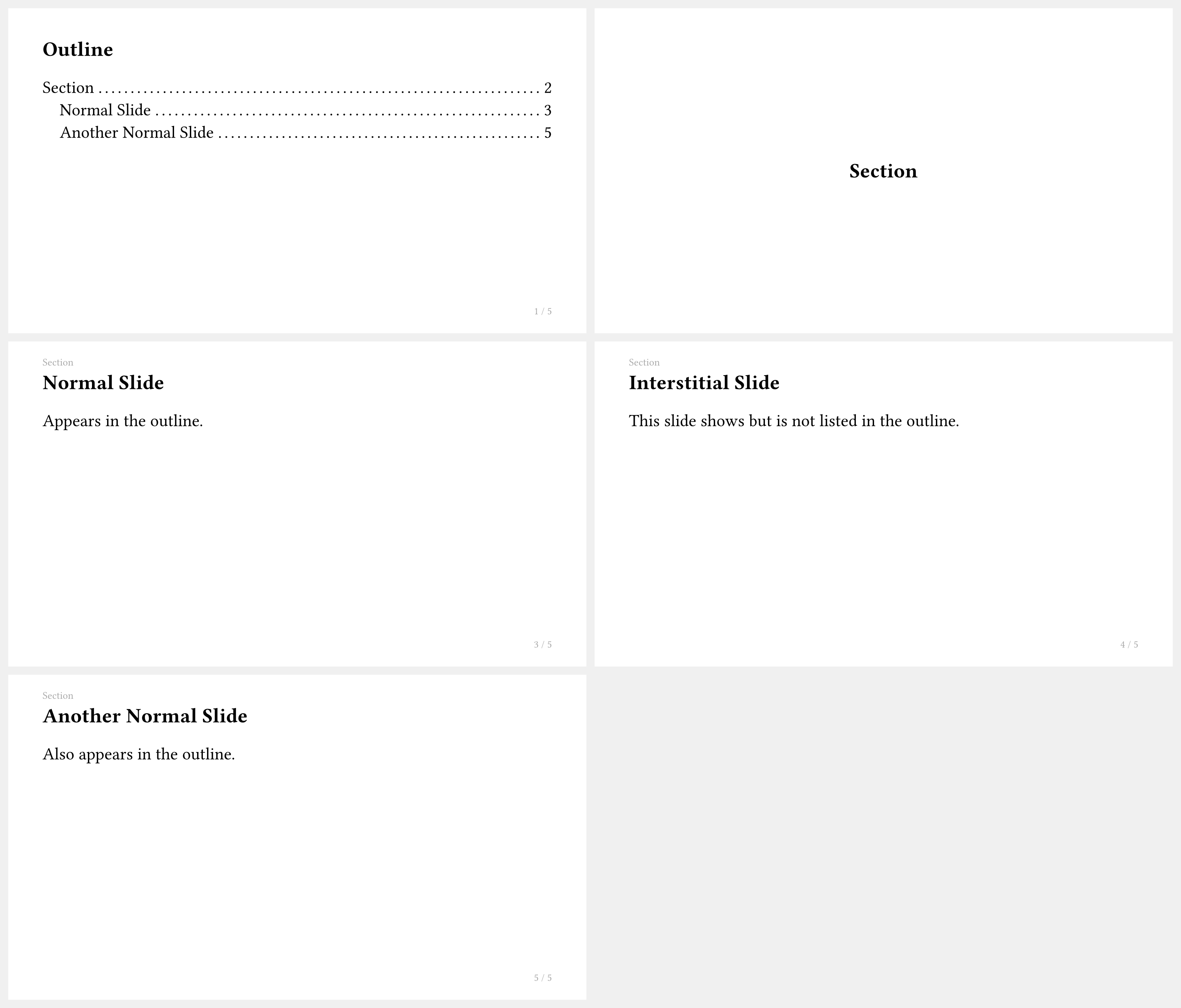
如何将幻灯片从目录中排除但仍然显示?
使用 <touying:unoutlined> 标签:
#import "@preview/touying:0.7.4": *
#import themes.simple: *
#show: simple-theme
== Outline <touying:hidden>

#components.adaptive-columns(outline(title: none, indent: 1em))

= Section

== Normal Slide

Appears in the outline.

== Interstitial Slide <touying:unoutlined>

This slide shows but is not listed in the outline.

== Another Normal Slide

Also appears in the outline.
如何控制哪个标题级别创建新幻灯片?
使用 config-common(slide-level: ...),默认值因主题而异:
#import "@preview/touying:0.7.4": *
#import themes.simple: *
#show: simple-theme.with(
  aspect-ratio: "16-9",
  config-common(slide-level: 2),
)
= Section

This text is part of the section slide.

== Subsection Slide

Each `==` heading creates a new slide.

=== Sub-subheading

Sub-subheadings do not create new slides.
如何添加自定义页眉或页脚?
使用 config-page(header: ..., footer: ...):
#import "@preview/touying:0.7.4": *
#import themes.default: *
#show: default-theme.with(
  aspect-ratio: "16-9",
  config-page(
    header: text(gray)[My Custom Header],
    footer: context align(right, text(gray)[
      Slide #utils.slide-counter.display()
    ]),
  ),
)
= Section

== Slide

Slide with a custom header and footer.
测试与开发
如何运行 Touying 的测试套件?
Touying 使用 tytanic 测试框架。
安装 tytanic:
cargo binstall tytanic
运行测试:
tt run
测试位于 tests/ 目录下,分为:
features/— 功能测试themes/— 主题测试integration/— 第三方包集成测试(cetz、fletcher、pinit、theorion、codly、mitex)issues/— 回归测试examples/— 示例测试
如何为 Touying 贡献代码?
贡献流程:
- Fork touying-typ/touying 仓库
- 创建功能分支:
git checkout -b feature/my-feature - 修改代码并用 typstyle 格式化
- 运行
tt run确保所有测试通过 - 提交并推送到你的 fork
- 创建 Pull Request
其他问题
如何设置演示文稿的标题、作者和日期?
使用 config-info(...):
#import "@preview/touying:0.7.4": *
#import themes.metropolis: *
#show: metropolis-theme.with(
  aspect-ratio: "16-9",
  config-info(
    title: [My Presentation],
    subtitle: [A Subtitle],
    author: [Jane Doe],
    date: datetime.today(),
    institution: [My University],
  ),
)
#title-slide()
= Introduction

== First Slide

Content here.
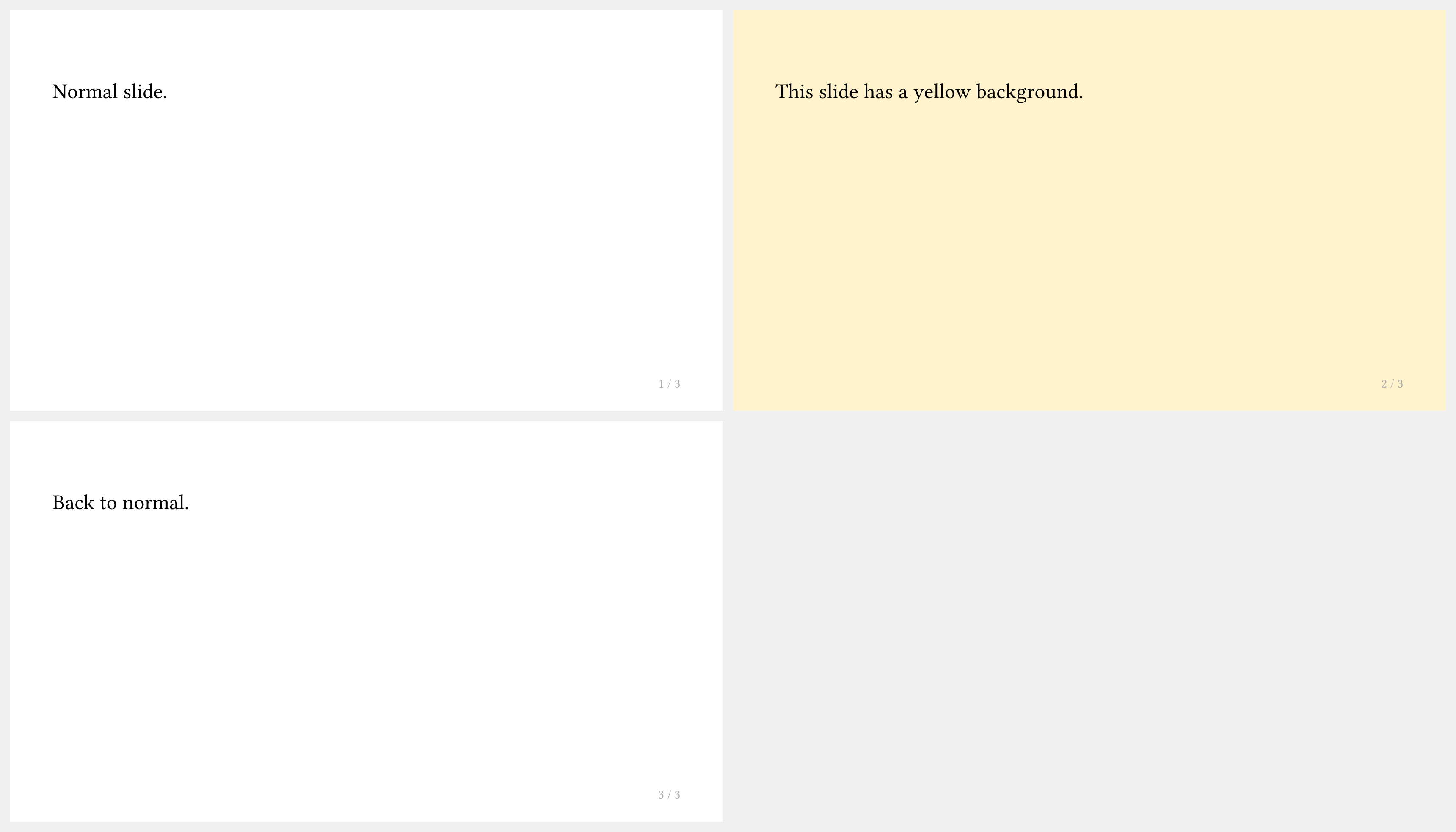
如何为单张幻灯片覆盖配置?
使用 touying-set-config 包裹需要更改的内容:
#import "@preview/touying:0.7.4": *
#import themes.simple: *
#show: simple-theme
#slide[
  Normal slide.
]

#touying-set-config(config-page(fill: rgb("#fff3cd")))[
  #slide[
    This slide has a yellow background.
  ]
]

#slide[
  Back to normal.
]
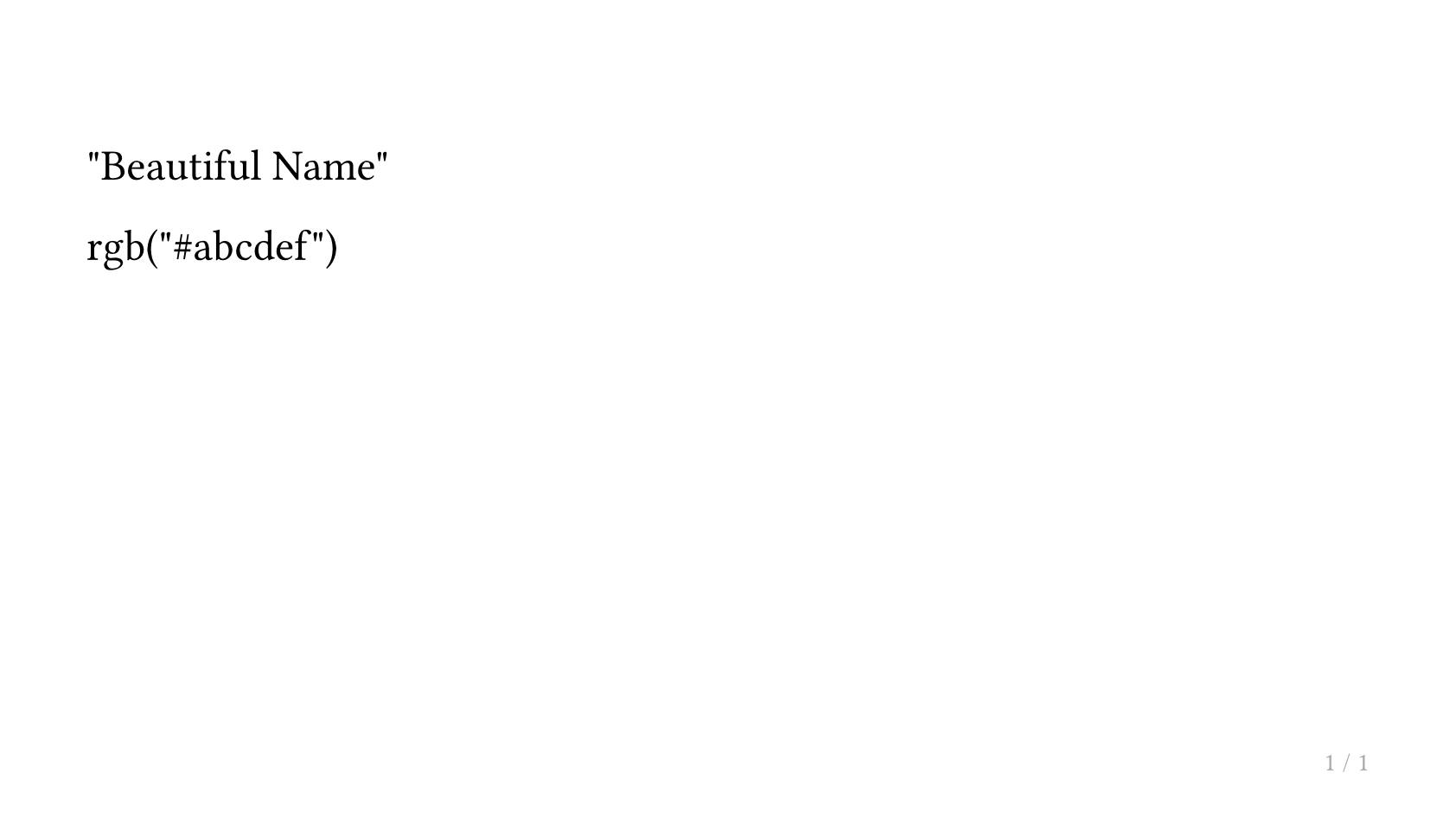
如何访问全局或幻灯片的配置信息?
在需要获取配置的位置使用 touying-get-config。由于配置只能在 context 时机访问,因此基于此进行计算可能会导致问题。
如果在含有局部配置的幻灯片内调用此函数,返回的将是局部配置,而非全局�配置。
#import "@preview/touying:0.7.4": *
#import themes.simple: *
#show: simple-theme.with(
  config-info(author: "Beautiful Name")
)
#slide(config:config-colors(primary: rgb("ABCDEF")))[
  #touying-get-config().info.author

  #touying-get-config().colors.primary
]
如何编译 Touying 演示文稿?
Touying 是一个纯 Typst 包,无需额外的构建步骤:
typst compile slides.typ
编辑时进行实时预览:
typst watch slides.typ
或者使用 Typst Preview VS Code 扩展进行即时编辑器内预览。
如何创建多文件演示文稿?
从主入口文件导入 lib.typ,并用 include 引入各章节:
// main.typ
#import "@preview/touying:0.7.4": *
#import themes.simple: *

#show: simple-theme.with(aspect-ratio: "16-9")

#include "intro.typ"
#include "methods.typ"
#include "results.typ"
每个被引入的文件正常使用标题即可,无需在每个文件中重复导入。
如何在页眉或页脚中显示当前章节名称?
使用 utils.display-current-heading(...) 或 utils.display-current-short-heading(...):
#import "@preview/touying:0.7.4": *
#import themes.default: *
#show: default-theme.with(
  aspect-ratio: "16-9",
  config-page(
    header: context text(gray)[
      #utils.display-current-heading(level: 1)
    ],
  ),
)
= My Section

== Slide

The header shows the current section name.
如何将 Touying 与 pinit 包配合使用?
正常导入两个包并在幻灯片中使用 #pin/#pinit-highlight:
#import "@preview/touying:0.7.4": *
#import "@preview/pinit:0.2.2": *
#import themes.simple: *

#show: simple-theme.with(aspect-ratio: "16-9")

#slide[
  A #pin(1)key term#pin(2) to highlight.

  #pinit-highlight(1, 2)
]
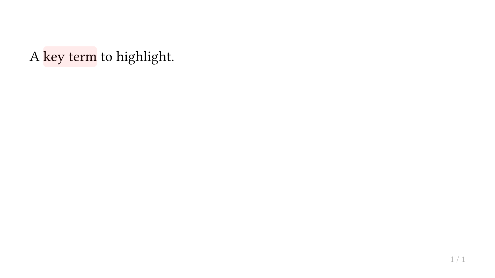
如需带动画的 pin 展示效果,请使用回调�式 slide,以便 #pause 与 pinit 正确交互。
如何在子幻灯片间冻结计数器(图表、公式)?
Touying 默认会在子幻灯片之间冻结常用计数器。如果需要额外冻结其他计数器,请把计数器数组传给 frozen-counters:
#show: simple-theme.with(
  config-common(frozen-counters: (counter("my-custom-counter"),)),
)
如何禁用/启用警告?
Touying 使用 uniwarn 来处理其命名空间为 touying 的警告。
我们在 Touying 中绑定了相关函数,因此你可以直接这样做:
#import "@preview/touying:0.7.4": *

// 禁用 Touying 发出的警告
#touying-disable-warnings
// 重新启用 Touying 发出的警告
#touying-enable-warnings
你也可以这样做:
#import "@preview/uniwarn:0.1.0"
#uniwarn.disable-warnings("touying")
#uniwarn.enable-warnings("touying")