University Theme
This aesthetically pleasing theme is courtesy of Pol Dellaiera.
Initialization
You can initialize the theme with the following code:
#import "@preview/touying:0.7.4": *
#import themes.university: *

#import "@preview/numbly:0.1.0": numbly

#show: university-theme.with(
  aspect-ratio: "16-9",
  config-info(
    title: [Title],
    subtitle: [Subtitle],
    author: [Authors],
    date: datetime.today(),
    institution: [Institution],
    contact: [contact\@mail.com],
    logo: emoji.school,
  ),
)

#set heading(numbering: numbly("{1}.", default: "1.1"))

#title-slide()
The university-theme function accepts the following parameters:
aspect-ratio: The aspect ratio of the slides, either "16-9" or "4-3", with a default of "16-9".progress-bar: Whether to display a progress bar at the top of the slide, with a default oftrue.header: The content displayed in the header, with a default ofutils.display-current-heading(level: 2), or you can pass a function likeself => self.info.title.header-right: The content displayed on the right side of the header, with a default ofself => self.info.logo.footer-columns: The widths of the three columns in the footer, with a default of(25%, 1fr, 25%).footer-a: The first column, with a default ofself => self.info.author.footer-b: The second column, with a default ofself => if self.info.short-title == auto { self.info.title } else { self.info.short-title }.footer-c: The third column, with a default of
self => {
  h(1fr)
  utils.display-info-date(self)
  h(1fr)
  context utils.slide-counter.display() + " / " + utils.last-slide-number
  h(1fr)
}
Color Theme
The University theme uses the following color scheme by default:
config-colors(
  primary: rgb("#04364A"),
  secondary: rgb("#176B87"),
  tertiary: rgb("#448C95"),
  neutral-lightest: rgb("#ffffff"),
  neutral-darkest: rgb("#000000"),
)
You can modify this color scheme using config-colors().
Slide Function Family
The University theme provides a series of custom slide functions:
#title-slide(logo: none, authors: none, ..args)
The title-slide function reads information from self.info for display, and you can also pass a logo parameter and an array-type authors parameter.
#slide(
  config: (:),
  repeat: auto,
  setting: body => body,
  composer: cols,
  // university theme
  title: none,
)[
  ...
]
A standard slide function with a title and footer by default, where title defaults to the current section title, and the footer is the one you set.
Focus Slide
#focus-slide(background-img: ..., background-color: ...)[
  ...
]
Used to capture the audience's attention. The default background color is self.colors.primary.
Matrix Slide
#matrix-slide(columns: ..., rows: ...)[
  ...
][
  ...
]
Refer to the documentation.
Example
#import "@preview/touying:0.7.4": *
#import themes.university: *
#import "@preview/numbly:0.1.0": numbly
#show: university-theme.with(
aspect-ratio: "16-9",
config-info(
title: [Title],
subtitle: [Subtitle],
author: [Authors],
date: datetime.today(),
institution: [Institution],
contact: [contact\@mail.com],
logo: emoji.school,
),
)
#set heading(numbering: numbly("{1}.", default: "1.1"))
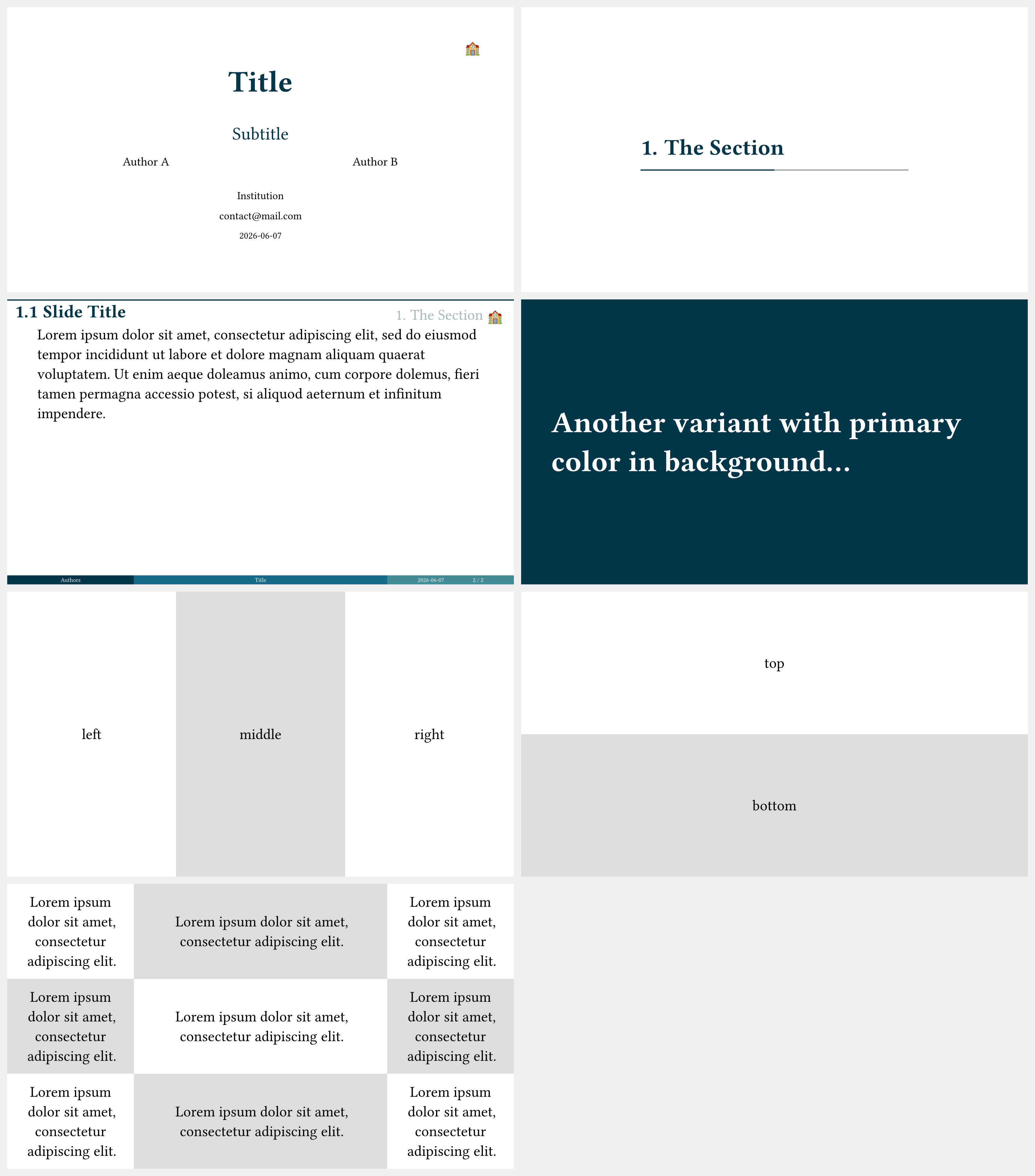
#title-slide(authors: ([Author A], [Author B]))
= The Section
== Slide Title
#lorem(40)
#focus-slide[
Another variant with primary color in background...
]
#matrix-slide[
left
][
middle
][
right
]
#matrix-slide(columns: 1)[
top
][
bottom
]
#matrix-slide(columns: (1fr, 2fr, 1fr), ..(lorem(8),) * 9)