Dewdrop Theme
This theme takes inspiration from Zhibo Wang's BeamerTheme and has been modified by OrangeX4.
The Dewdrop theme features an elegantly designed navigation, including two modes: sidebar and mini-slides.
Initialization
You can initialize it using the following code:
#import "@preview/touying:0.7.4": *
#import themes.dewdrop: *

#import "@preview/numbly:0.1.0": numbly

#show: dewdrop-theme.with(
  aspect-ratio: "16-9",
  footer: self => self.info.institution,
  navigation: "mini-slides",
  config-info(
    title: [Title],
    subtitle: [Subtitle],
    author: [Authors],
    date: datetime.today(),
    institution: [Institution],
    contact: [contact\@mail.com],
  ),
)

#title-slide()

#outline-slide()
The dewdrop-theme function accepts the following parameters:
aspect-ratio: The aspect ratio of the slides, which can be "16-9" or "4-3", with a default of "16-9".navigation: The style of the navigation bar, which can be"sidebar","mini-slides", ornone, with a default of"sidebar".sidebar: Settings for the sidebar navigation, with default values of(width: 10em, filled: false, numbered: false, indent: .5em, short-heading: true).mini-slides: Settings for the mini-slides navigation, with default values of(height: 4em, x: 2em, display-section: false, display-subsection: true, linebreaks: true, short-heading: true).height: The height of the mini-slides, with a default of4em.x: The x-axis padding for the mini-slides, with a default of2em.display-section: Whether to display slides after the section and before the subsection, with a default offalse.display-subsection: Whether to display slides in subsections, with a default oftrue.
footer: The content displayed in the footer of the slides, with a default ofnone. You can customize it with a function, such asself => self.info.author.footer-right: The content displayed on the right side of the footer, with a default ofcontext utils.slide-counter.display() + " / " + utils.last-slide-number.primary: The primary color of the theme, with a default ofrgb("#0c4842").alpha: The transparency level, with a default of60%.
Additionally, the Dewdrop theme provides a #alert[..] function, which you can use with the #show strong: alert syntax to create emphasized alert text.
Color Theme
The Dewdrop theme uses the following color scheme by default:
config-colors(
  neutral-darkest: rgb("#000000"),
  neutral-dark: rgb("#202020"),
  neutral-light: rgb("#f3f3f3"),
  neutral-lightest: rgb("#ffffff"),
  primary: primary,
)
You can modify this color scheme using the config-colors() function. This allows you to tailor the color palette of your slides to match the aesthetic you're aiming for or to conform to a specific branding guideline.
Slide Function Family
The Dewdrop theme provides a variety of custom slide functions:
#title-slide(extra: none, ..args)
title-slide reads information from self.info for display, and you can also pass in an extra parameter to display additional information.
#slide(
  config: (:),
  repeat: auto,
  setting: body => body,
  composer: cols,
)[
  ...
]
A default slide with navigation and footer, where the footer is what you set.
#focus-slide[
  ...
]
Used to draw attention, with the background color set to self.colors.primary.
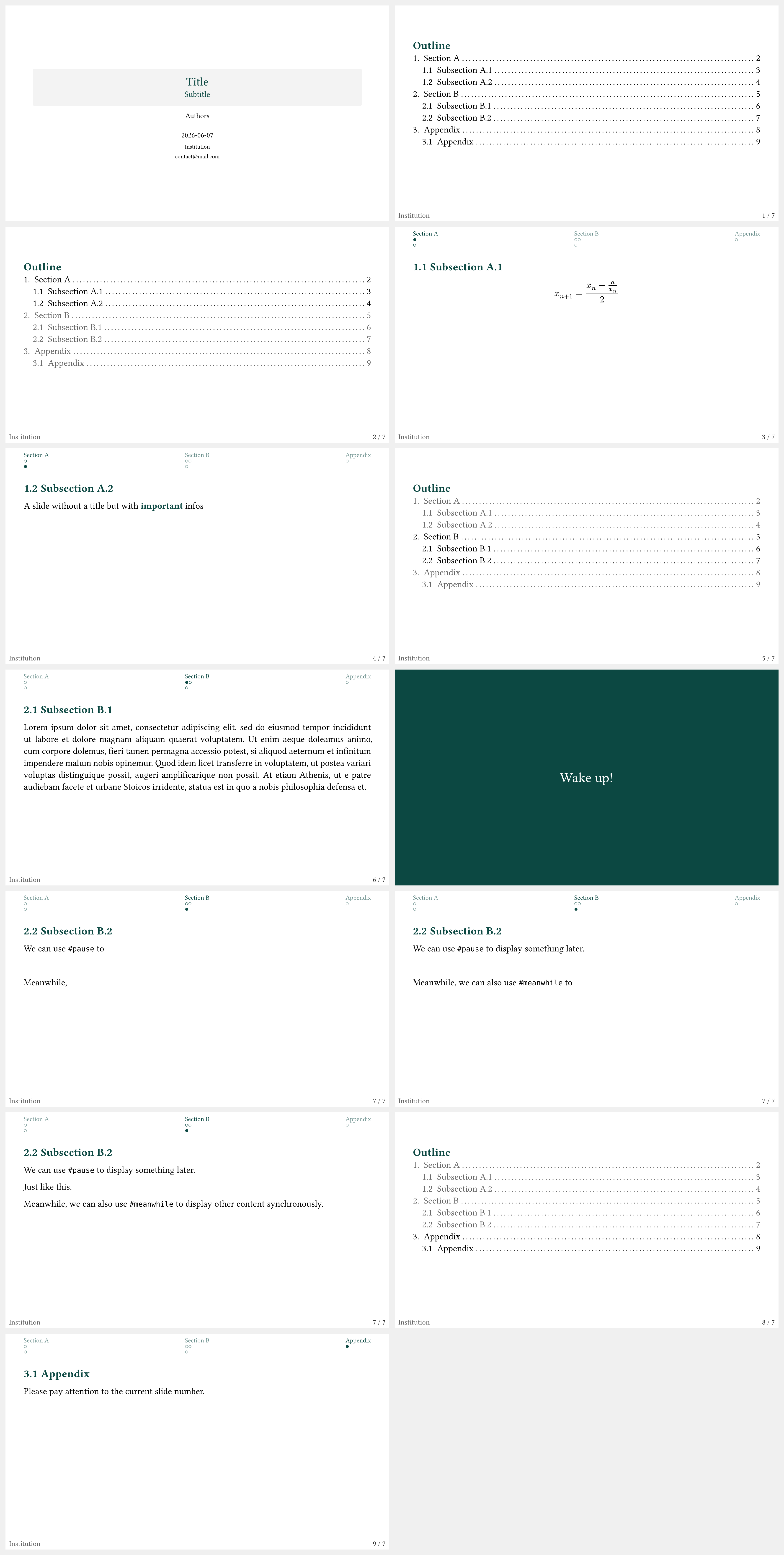
Example
#import "@preview/touying:0.7.4": *
#import themes.dewdrop: *

#import "@preview/numbly:0.1.0": numbly

#show: dewdrop-theme.with(
  aspect-ratio: "16-9",
  footer: self => self.info.institution,
  navigation: "mini-slides",
  config-info(
    title: [Title],
    subtitle: [Subtitle],
    author: [Authors],
    date: datetime.today(),
    institution: [Institution],
    contact: [contact\@mail.com],
  ),
)

#set heading(numbering: numbly("{1}.", default: "1.1"))

#title-slide()

#outline-slide()

= Section A

== Subsection A.1

$ x_(n+1) = (x_n + a/x_n) / 2 $

== Subsection A.2

A slide without a title but with *important* infos

= Section B

== Subsection B.1

#lorem(80)

#focus-slide[
  Wake up!
]

== Subsection B.2

We can use `#pause` to #pause display something later.

#pause

Just like this.

#meanwhile

Meanwhile, #pause we can also use `#meanwhile` to #pause display other content synchronously.

#show: appendix

= Appendix

== Appendix

Please pay attention to the current slide number.