Metropolis Theme
This theme draws inspiration from Matthias Vogelgesang's Metropolis beamer theme and has been modified by Enivex.
The Metropolis theme is elegant and suitable for everyday use. It is recommended to have Fira Sans and Fira Math fonts installed on your computer for the best results.
Initialization
You can initialize it using the following code:
#import "@preview/touying:0.7.0": *
#import themes.metropolis: *

#import "@preview/numbly:0.1.0": numbly

#show: metropolis-theme.with(
  aspect-ratio: "16-9",
  footer: self => self.info.institution,
  config-info(
    title: [Title],
    subtitle: [Subtitle],
    author: [Authors],
    date: datetime.today(),
    institution: [Institution],
    logo: emoji.city,
  ),
)

#set heading(numbering: numbly("{1}.", default: "1.1"))

#title-slide()
The metropolis-theme in the theme accepts the following parameters:
aspect-ratio: The aspect ratio of the slides, which can be "16-9" or "4-3", with a default of "16-9".align: The alignment of the content within the slides, with a default ofhorizon(horizontal alignment).header: The content displayed in the header of the slides, with a default that displays the current heading adjusted to fit the width (utils.display-current-heading(setting: utils.fit-to-width.with(grow: false, 100%))). Alternatively, you can provide a function likeself => self.info.titleto customize the header content.header-right: The content displayed on the right side of the header, with a default that shows the logo specified inself.info.logo.footer: The content displayed in the footer of the slides, with a default of an empty array[]. You can customize it with a function, for example, to display the author's information:self => self.info.author.footer-right: The content displayed on the right side of the footer, with a default that shows the slide number and the total number of slides (context utils.slide-counter.display() + " / " + utils.last-slide-number).footer-progress: A boolean value indicating whether to display a progress bar at the bottom of the slides, with a default oftrue.
Color Theme
Metropolis uses the following default color theme:
config-colors(
  primary: rgb("#eb811b"),
  primary-light: rgb("#d6c6b7"),
  secondary: rgb("#23373b"),
  neutral-lightest: rgb("#fafafa"),
  neutral-dark: rgb("#23373b"),
  neutral-darkest: rgb("#23373b"),
)
You can modify this color theme using config-colors().
Slide Function Family
The Metropolis theme provides a variety of custom slide functions:
#title-slide(extra: none, ..args)
title-slide reads information from self.info for display, and you can also pass in an extra parameter to display additional information.
#slide(
  config: (:),
  repeat: auto,
  setting: body => body,
  composer: components.side-by-side,
  // metropolis theme
  title: auto,
  footer: auto,
  align: horizon,
)[
  ...
]
A default slide with headers and footers, where the title defaults to the current section title, and the footer is what you set.
#focus-slide[
  ...
]
Used to draw attention, with the background color set to self.colors.primary-dark.
#new-section-slide(short-title: auto, title)
Creates a new section with the given title.
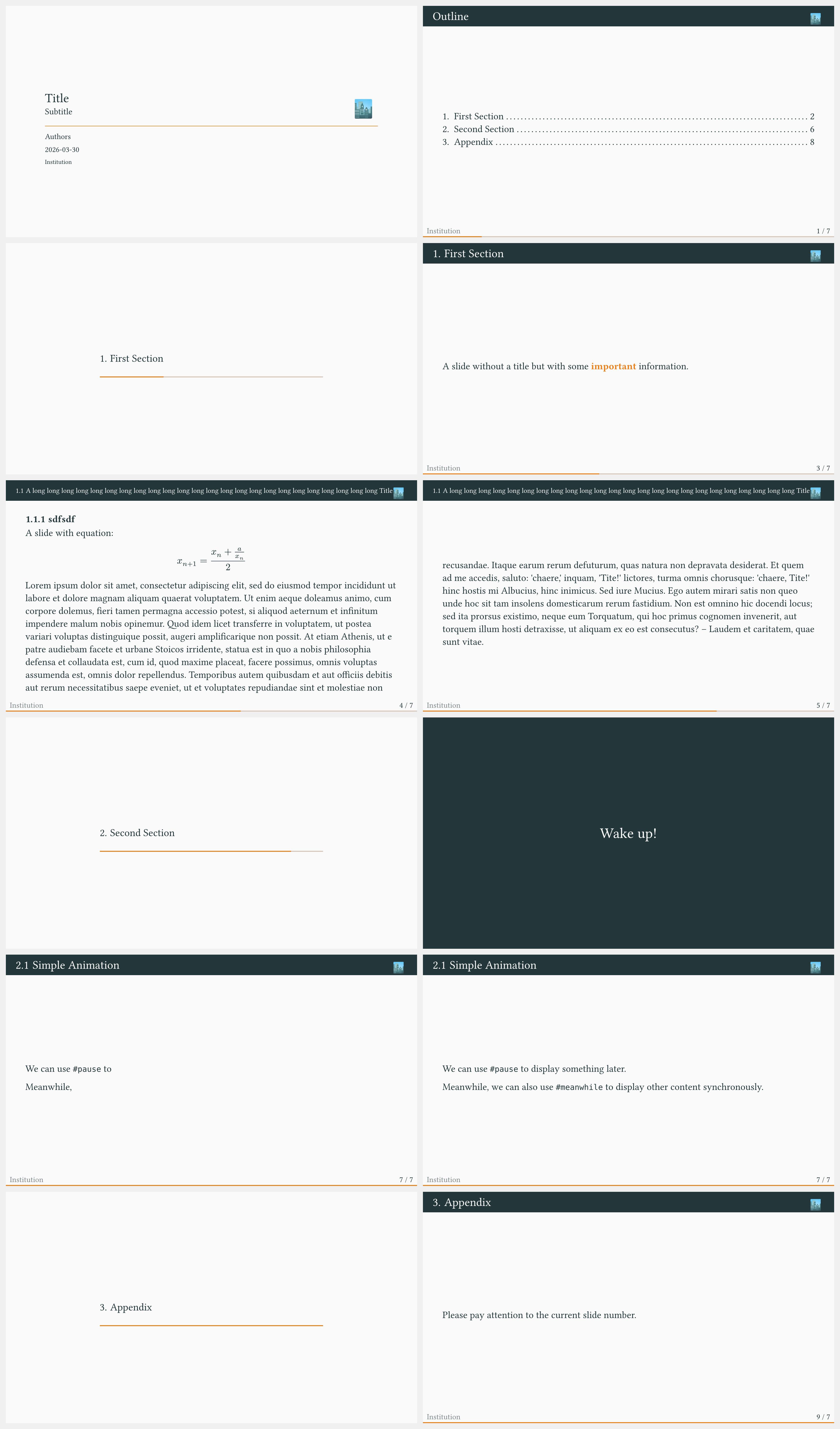
Example
#import "@preview/touying:0.7.0": *
#import themes.metropolis: *

#import "@preview/numbly:0.1.0": numbly

#show: metropolis-theme.with(
  aspect-ratio: "16-9",
  footer: self => self.info.institution,
  config-info(
    title: [Title],
    subtitle: [Subtitle],
    author: [Authors],
    date: datetime.today(),
    institution: [Institution],
    logo: emoji.city,
  ),
)

#set heading(numbering: numbly("{1}.", default: "1.1"))

#title-slide()

= Outline <touying:hidden>

#outline(title: none, indent: 1em, depth: 1)

= First Section

---

A slide without a title but with some *important* information.

== A long long long long long long long long long long long long long long long long long long long long long long long long Title

=== sdfsdf

A slide with equation:

$ x_(n+1) = (x_n + a/x_n) / 2 $

#lorem(200)

= Second Section

#focus-slide[
  Wake up!
]

== Simple Animation

We can use `#pause` to #pause display something later.

#meanwhile

Meanwhile, #pause we can also use `#meanwhile` to display other content synchronously.

#speaker-note[
  + This is a speaker note.
  + You won't see it unless you use `config-common(show-notes-on-second-screen: right)`
]

#show: appendix

= Appendix

---

Please pay attention to the current slide number.
