Page Layout
Basic Concepts
To create stylish slides using Typst, it's essential to understand Typst's page model correctly. If you're not concerned with customizing page styles, you can choose to skip this section. However, it's still recommended to go through it.
Let's illustrate Typst's default page model through a specific example.
#let container = rect.with(height: 100%, width: 100%, inset: 0pt)
#let innerbox = rect.with(stroke: (dash: "dashed"))

#set text(size: 30pt)
#set page(
  paper: "presentation-16-9",
  header: container[#innerbox[Header]],
  header-ascent: 30%,
  footer: container[#innerbox[Footer]],
  footer-descent: 30%,
)

#place(top + right)[Margin→]
#container[
  #container[
    #innerbox[Content]
  ]
]
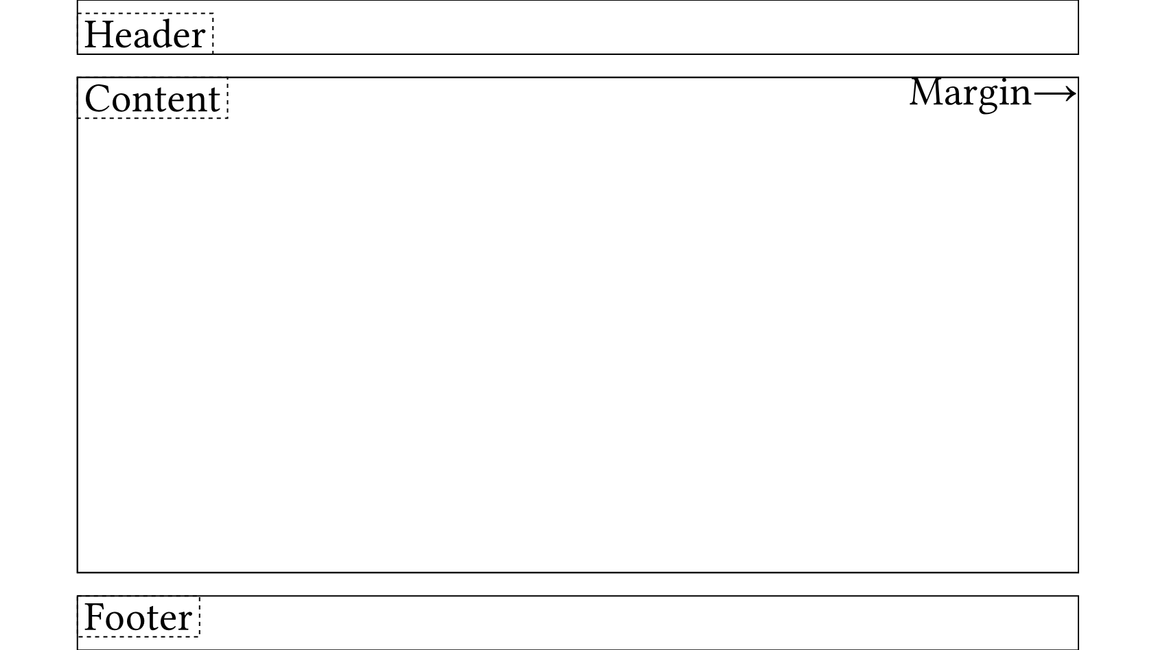
We need to distinguish the following concepts:
- Model: Typst has a model similar to the CSS Box Model, divided into Margin, Padding, and Content. However, padding is not a property of
set page(..)but is obtained by manually adding#pad(..). - Margin: Margins are the edges of the page, divided into top, bottom, left, and right. They are the core of Typst's page model, and all other properties are influenced by margins, especially Header and Footer. Header and Footer are actually located within the Margin.
- Header: The Header is the content at the top of the page, divided into container and innerbox. We can observe that the edge of the header container and padding does not align but has some space in between, which is actually
header-ascent: 30%, where the percentage is relative to the margin-top. Additionally, we notice that the header innerbox is actually located at the bottom left corner of the header container, meaning innerbox defaults to#set align(left + bottom). - Footer: The Footer is the content at the bottom of the page, similar to the Header but in the opposite direction.
- Place: The
placefunction enables absolute positioning relative to the parent container without affecting other elements inside the parent container. It allows specifyingalignment,dx, anddy, making it suitable for placing decorative elements like logos.
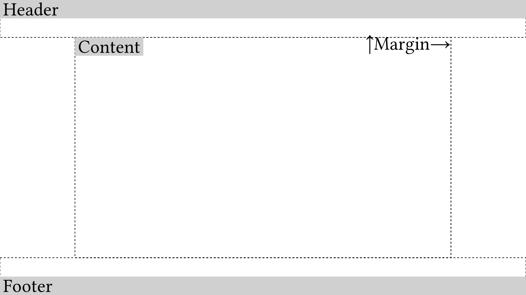
Therefore, to apply Typst to create slides, we only need to set:
#set page(
  margin: (x: 4em, y: 2em),
  header: align(top)[Header],
  footer: align(bottom)[Footer],
  header-ascent: 0em,
  footer-descent: 0em,
)
However, we still need to address how the header occupies the entire page width. Here, we use negative padding to achieve this. For instance:
#let container = rect.with(stroke: (dash: "dashed"), height: 100%, width: 100%, inset: 0pt)
#let innerbox = rect.with(fill: rgb("#d0d0d0"))
#let margin = (x: 4em, y: 2em)

// negative padding for header and footer
#let negative-padding = pad.with(x: -margin.x, y: 0em)

#set text(size: 30pt)
#set page(
  paper: "presentation-16-9",
  margin: margin,
  header: negative-padding[#container[#align(top)[#innerbox(width: 100%)[Header]]]],
  header-ascent: 0em,
  footer: negative-padding[#container[#align(bottom)[#innerbox(width: 100%)[Footer]]]],
  footer-descent: 0em,
)

#place(top + right)[↑Margin→]
#container[
  #container[
    #innerbox[Content]
  ]
]
Page Management
In Typst, using the set page(..) command to modify page parameters results in the creation of a new page, rather than modifying the current one. Therefore, Touying opts to maintain a self.page member variable.
For example, the previous example can be rewritten as:
#show: default-theme.with(
  config-page(
    margin: (x: 4em, y: 2em),
    header: align(top)[Header],
    footer: align(bottom)[Footer],
    header-ascent: 0em,
    footer-descent: 0em,
  ),
)
Touying will automatically detect the value of margin.x and determine whether to apply negative padding to the header if config-common(zero-margin-header: true) is set, which is equivalent to self.zero-margin-header = true.
Similarly, if you are not satisfied with the style of the header or footer of a particular theme, you can also modify it through:
config-page(footer: [Custom Footer])
Therefore, you should not use the set page(..) command yourself, as it will be reset by Touying.
With this approach, we can also query the current page parameters in real-time using self.page, which is very useful for functions that need to obtain the page margins or the current page background color, such as transparent-cover. This is somewhat equivalent to context get rule, and in practice, it is more convenient to use.
Page Columnization
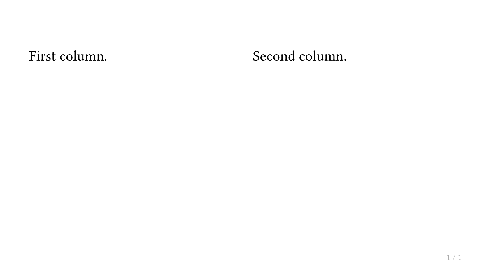
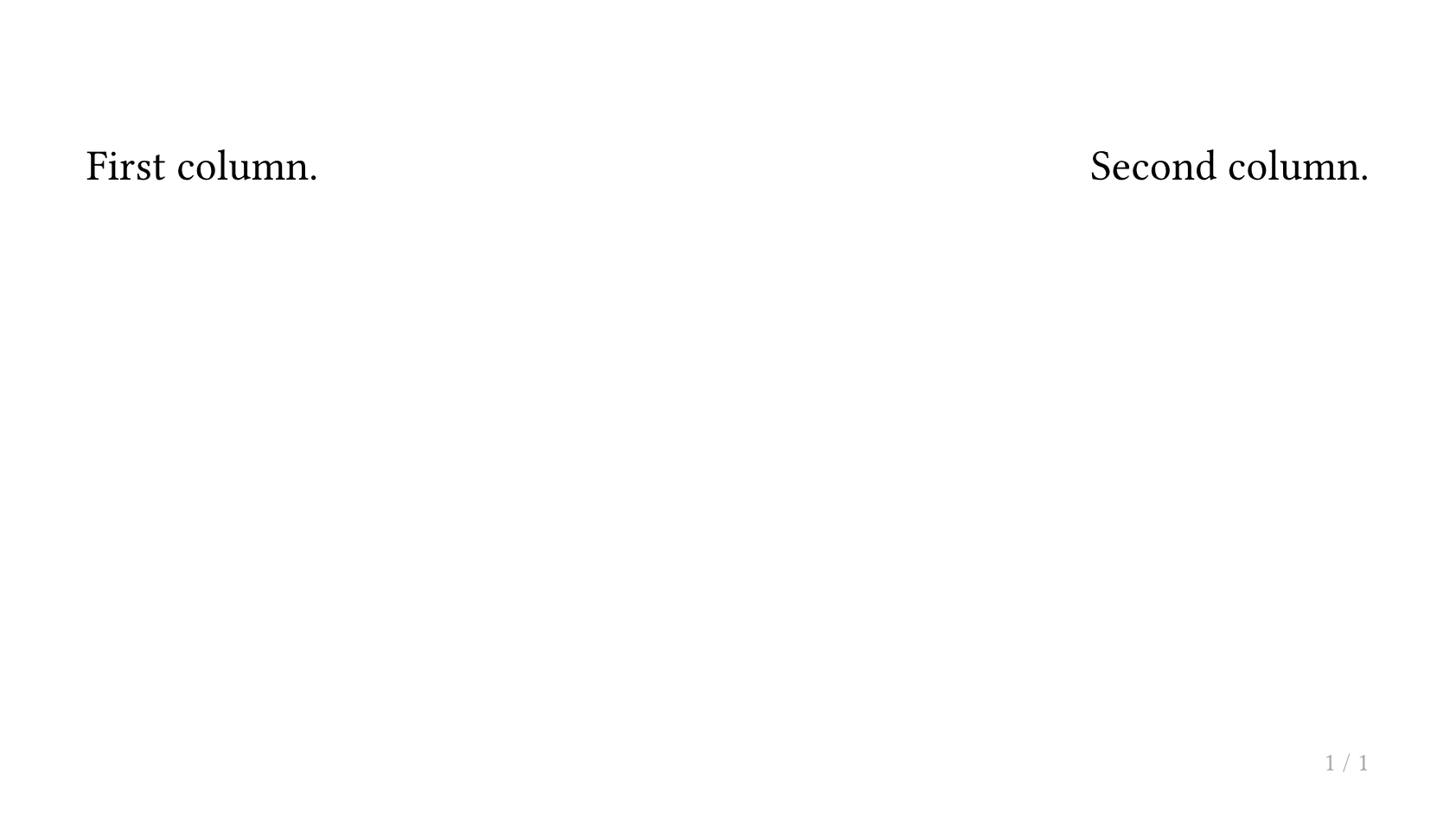
If you need to divide a page into two or three columns, you can use the composer feature provided by the default slide function in Touying. The simplest example is as follows:
#slide[
  First column.
][
  Second column.
]
If you need to change the way columns are divided, you can modify the composer parameter of slide, where the default parameter is cols.with(columns: auto, gutter: 1em). If we want the left column to take up the remaining width, we can use:
#slide(composer: (1fr, auto))[
  First column.
][
  Second column.
]
Equalizing Column Heights with lazy-v
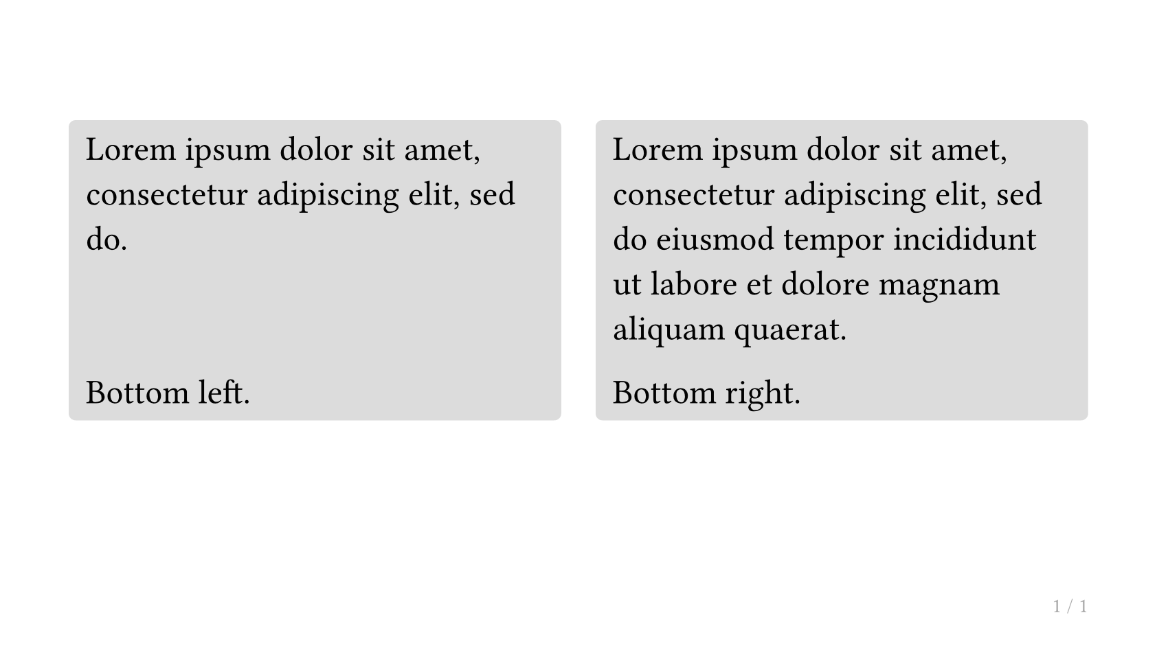
When using multi-column layouts (via cols or a manual grid), columns with different amounts of content will have different heights. If you want to push some "footer" content (e.g. a label or caption) to the bottom of each column and have it align across all columns, or simply want all columns to match the tallest one's height, you can use lazy-v together with lazy-layout.
How It Works
lazy-v(1fr)— Place this between the main content and the footer content inside a block. It acts as a deferred vertical spacer that is invisible during height measurement.lazy-layout— Wraps the multi-column layout. It first measures the natural height of all columns (ignoringlazy-vmarkers), then re-renders at that fixed height with the markers activated. This causes each column to stretch to match the tallest one, without the overall container expanding to fill the entire page.
Using cols (Recommended)
cols does not enable lazy-layout by default. Pass lazy-layout: true to cols, then add lazy-v(1fr) inside each block:
#cols(lazy-layout: true)[
  #block(fill: luma(220), inset: .5em, radius: .2em, width: 100%)[
    #lorem(10)
    #lazy-v(1fr)
    Bottom left.
  ]
][
  #block(fill: luma(220), inset: .5em, radius: .2em, width: 100%)[
    #lorem(20)
    #lazy-v(1fr)
    Bottom right.
  ]
]

Both columns will have the same height (matching the taller one), and "Bottom left." / "Bottom right." will be aligned at the bottom. The overall layout height equals the tallest column — it does not expand to fill the entire page.
This is different from using v(1fr) inside #slide[][]. The slide composer occupies the full page height, so v(1fr) works directly there. lazy-v is designed for standalone cols or lazy-layout calls where you want height equalization without full-page expansion.
Using a Manual Grid
You can also wrap a grid with lazy-layout directly:
#lazy-layout(grid(
  columns: (1fr, 1fr),
  gutter: 1em,
  block(fill: luma(220), inset: .5em, radius: .2em, width: 100%)[
    #lorem(10)
    #lazy-v(1fr)
    Bottom left.
  ],
  block(fill: luma(220), inset: .5em, radius: .2em, width: 100%)[
    #lorem(20)
    #lazy-v(1fr)
    Bottom right.
  ],
))
cols defaults to lazy-layout: false. Enable it only when you need height equalization.
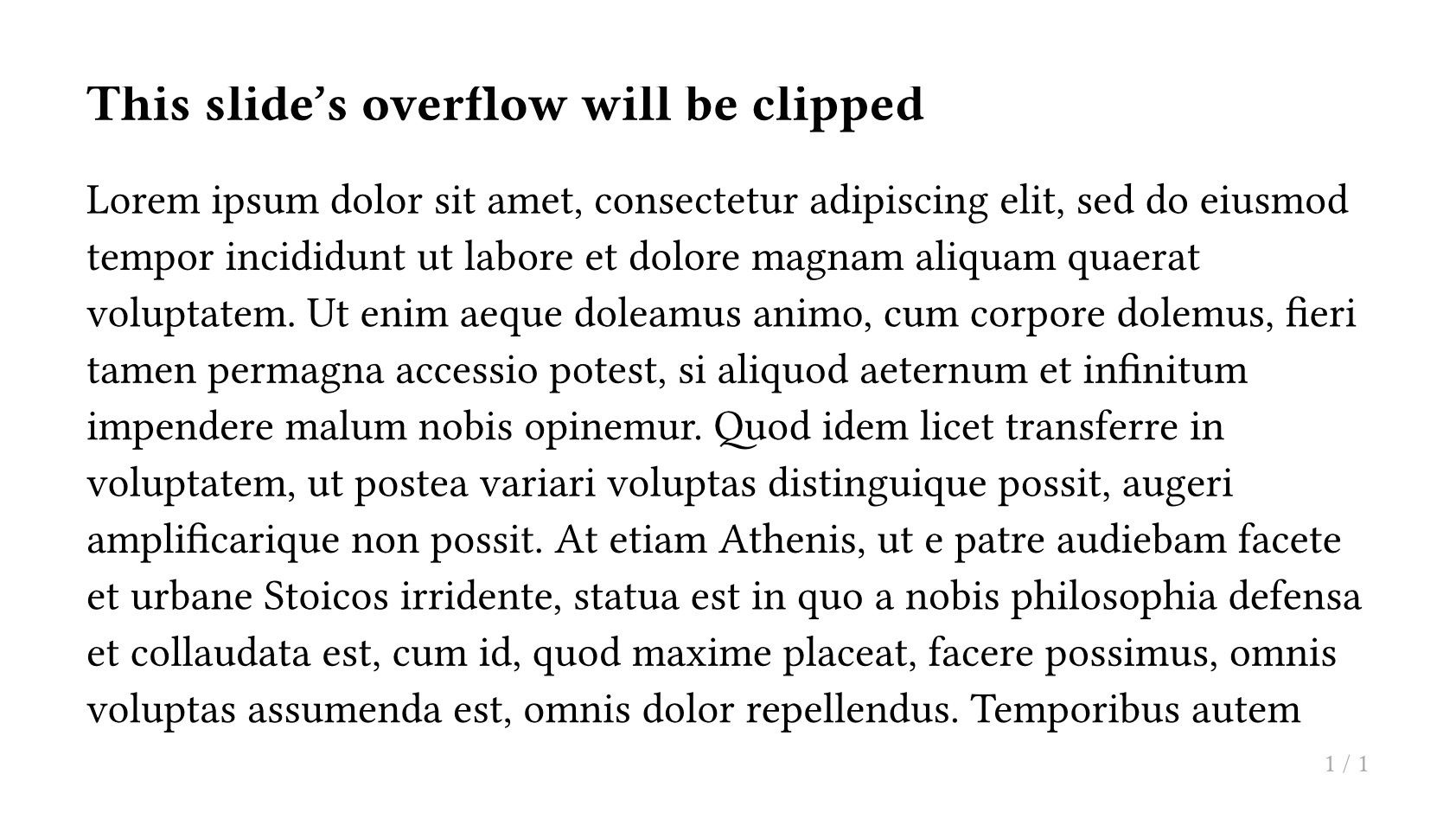
Preventing Content Overflow
By default, when slide content exceeds the page height, Touying automatically overflows the excess content to the next page. This is reasonable in most cases, but in scenarios that require strict control over page mapping — such as agentic workflows where an agent needs to reason about slide boundaries — you may want to disable this behavior.
Use config-common(breakable: false) to prevent content from overflowing:
// Prevent overflow, panic on overflow (default behavior when breakable: false)
#show: simple-theme.with(
  config-common(breakable: false),
)

// Prevent overflow and visually clip overflowing content
#show: simple-theme.with(
  config-common(breakable: false, clip: true),
)

// Prevent overflow, disable overflow detection (performance-first)
#show: simple-theme.with(
  config-common(breakable: false, detect-overflow: false),
)
Related parameters:
clip(defaultfalse): Whentrue, content that exceeds the slide height is visually truncated.detect-overflow(defaulttrue): Whentrue, a layout measurement is performed andpanic()is called if the content height exceeds the available slide height, making it easy to catch overflow early. Set tofalseto avoid the extra layout overhead.
clip and detect-overflow only take effect when breakable: false.
You can also dynamically switch these settings mid-presentation using touying-set-config:
== This slide's overflow will be clipped

// Enable clipping for a specific slide
#show: touying-set-config.with(config-common(clip: true))

#lorem(500)