Navigation Elements
For more advanced slide themes it is common to incorporate navigation elements. See e.g. the dewdrop theme.
Left-Right Navigation
lr-navigation creates clickable previous and next controls. It can navigate by slides and subslides (physical pages), or both.
#import "@preview/touying:0.7.4": *
#import themes.simple: *
#show: simple-theme.with(
footer: self=>[
#align(center,
lr-navigation(
self: self,
mode: "both",
show-useless: false,
nav: (
filled: sym.triangle.filled,
stroked: sym.chevron,
),
)
)
],
)
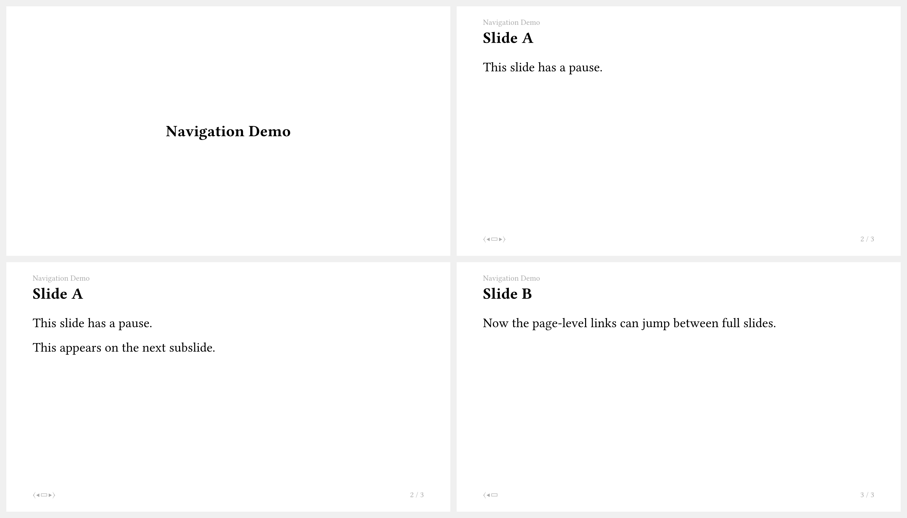
= Navigation Demo
== Slide A
This slide has a pause.
#pause
This appears on the next subslide.
== Slide B
Now the page-level links can jump between full slides.
Mini-Slides Navigation
components.mini-slides shows section and subsection links with small per-slide dots.
This pattern works well in the header when you want compact progress feedback without a full sidebar or a progressbar.
#import "@preview/touying:0.7.4": *
#import themes.simple: *
#show: simple-theme.with(
config-page(
margin: (top: 4em, bottom: 2em, x: 2em),
header-ascent: 2em,
),
header: self => components.mini-slides(
self: self,
fill: self.colors.primary,
display-section: true,
display-subsection: true,
linebreaks: true,
short-heading: true,
),
)
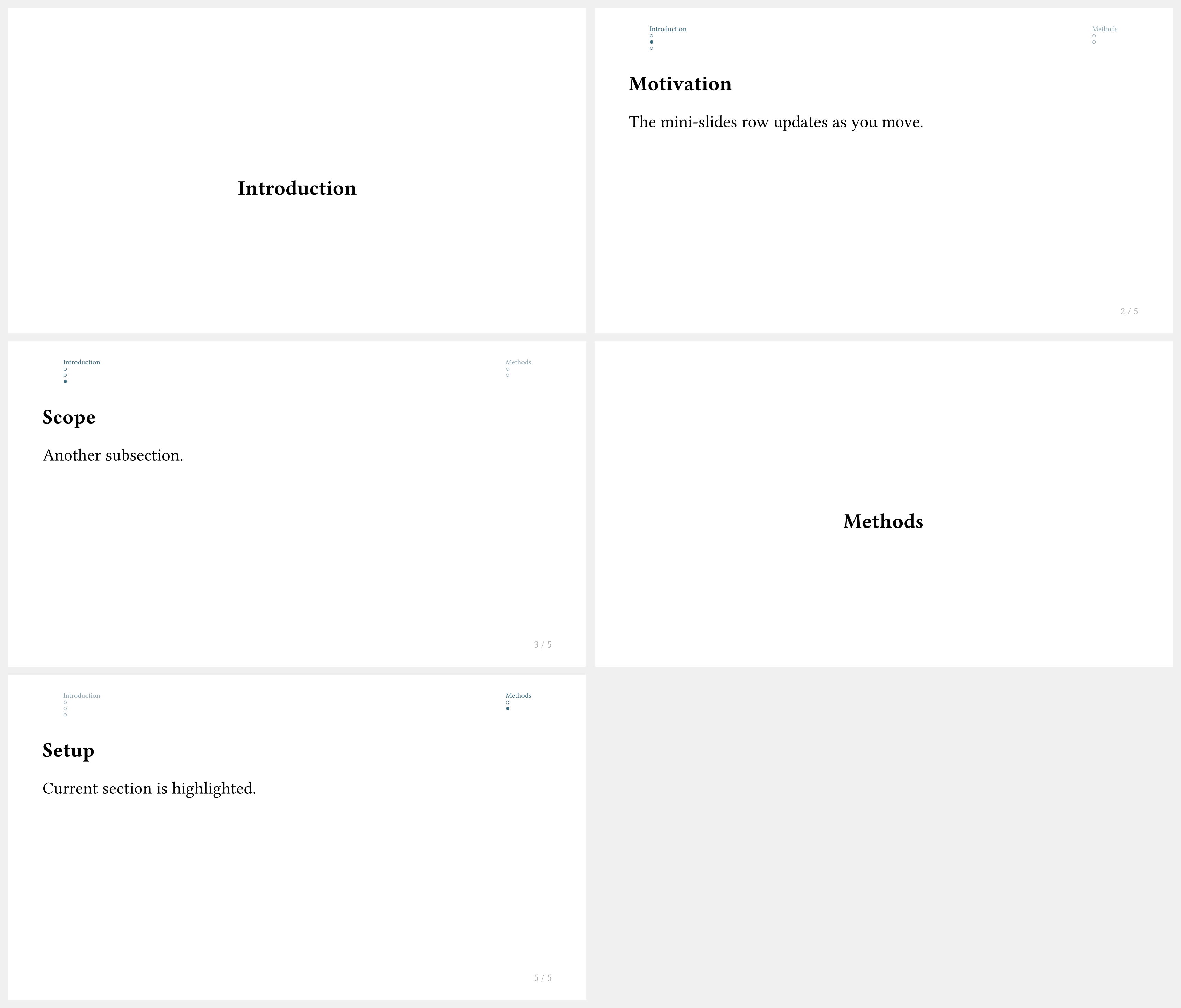
= Introduction
== Motivation
The mini-slides row updates as you move.
== Scope
Another subsection.
= Methods
== Setup
Current section is highlighted.
Sidebar Navigation
Touying does not provide a single sidebar-navigation function. In practice, a sidebar is built with components.custom-progressive-outline, as done by the Dewdrop theme.
The quickest way to use this style is to enable Dewdrop's built-in sidebar navigation and tune its options:
#import "@preview/touying:0.7.4": *
#import themes.dewdrop: *
#show: dewdrop-theme.with(
aspect-ratio: "16-9",
navigation: "sidebar",
sidebar: (
width: 11em,
filled: false,
numbered: true,
indent: .8em,
short-heading: true,
),
)
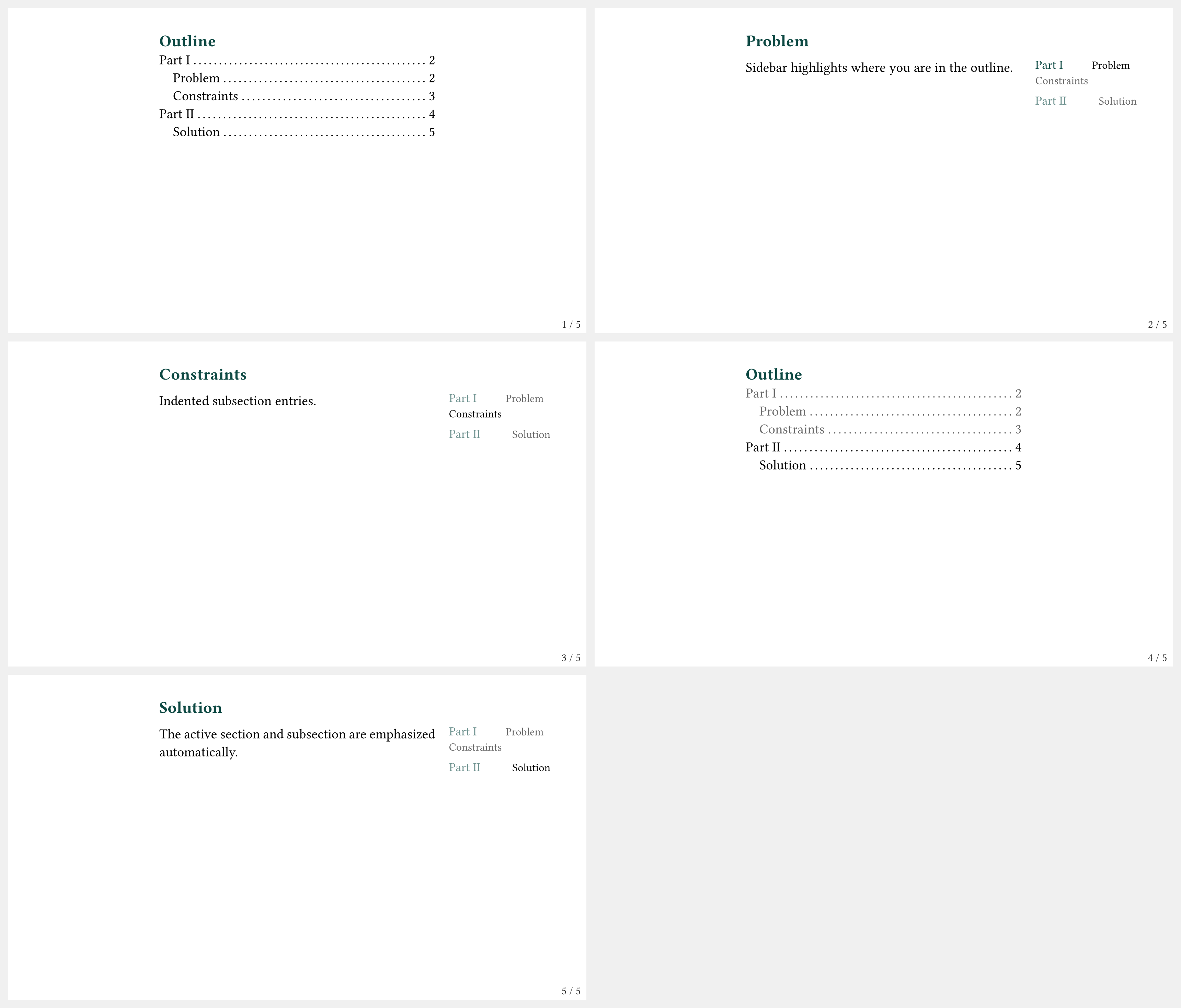
#outline-slide()
= Part I <touying:skip>
== Problem
Sidebar highlights where you are in the outline.
== Constraints
Indented subsection entries.
= Part II
== Solution
The active section and subsection are emphasized automatically.
If you want to copy this approach, take a look at how it is implemented for the dewdrop theme.